One week can be explained away. Some teams play over their heads thanks to good bounces, while others head in the other direction, perhaps due to lingering...
5 Pleasant Surprises from the Start of the NHL Season
Oct 26, 2022
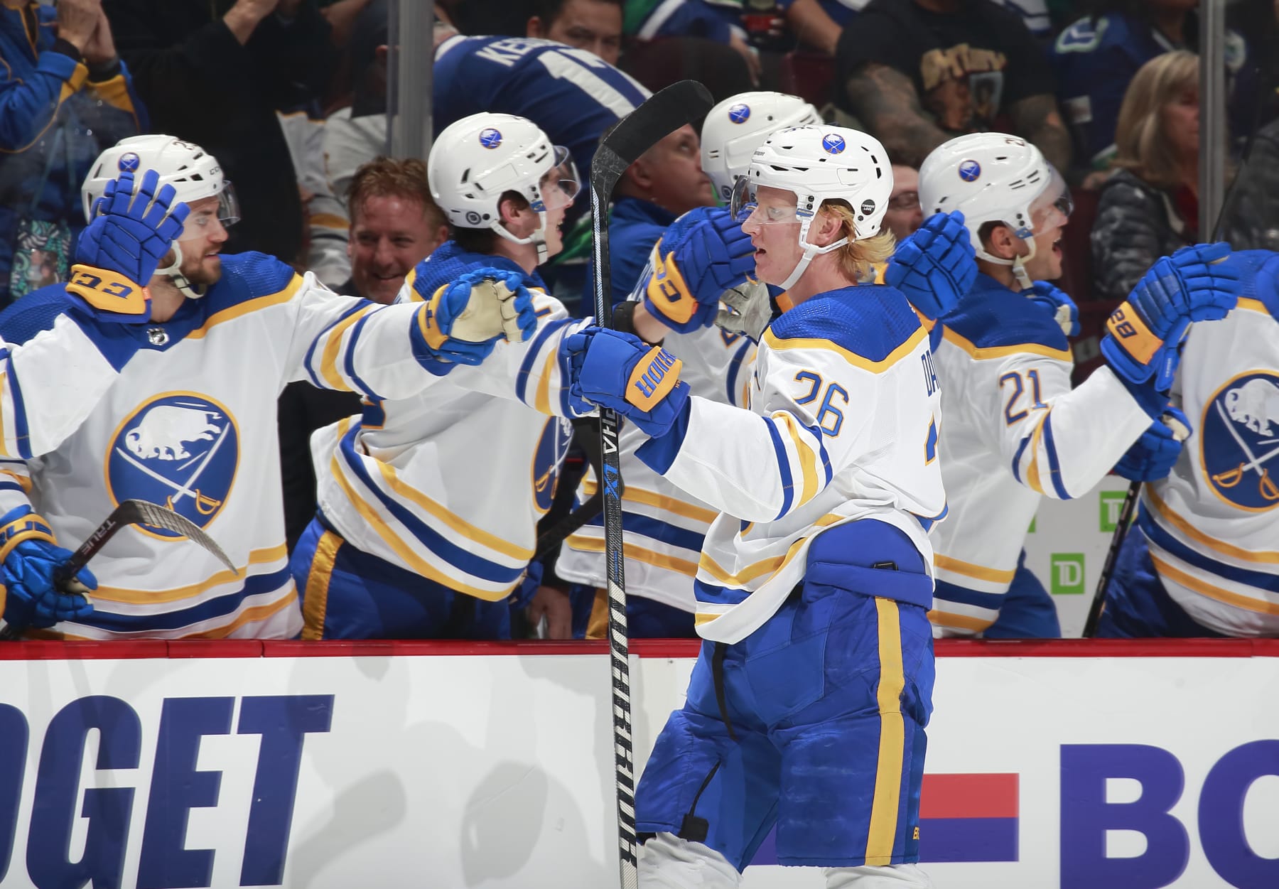
VANCOUVER, CANADA - OCTOBER 22: Rasmus Dahlin #26 of the Buffalo Sabres is congratulated by teammates after scoring during their NHL game against the Vancouver Canucks at Rogers Arena October 22, 2022 in Vancouver, British Columbia, Canada. (Photo by Jeff Vinnick/NHLI via Getty Images)
One of the best things about hockey is the uncertainty. We make our predictions, study the game to death, pretend to understand the charts that say the players we like are good and hope for the best. A lot of the time all of the preparation works out, but sometimes hockey forces us to throw it all out the window and enjoy the ride.
The 2022-23 NHL season isn't even one month old yet and there's already so much to be wrong about. Yay! I'm sure we'll get to the unpleasant surprises eventually, but for now, why don't we enjoy the good?
As it turns out, a lot of the pleasant surprises through the first two weeks of the season are oddly connected to each other. Noted Ottawa Senators fan Alanis Morissette said it best, "Life has a funny way of helping you out." Clearly, she was talking about the Vegas Golden Knights.
Anyway, let's take a look at the most pleasant surprises in the NHL while the season's still a baby.
1. Rasmus Dahlin and the Sabres
Breaking news, folks: 2018 first overall draft pick Rasmus Dahlin might actually be good.
Sometimes I wonder if we'll ever learn our lesson when it comes to this stuff, but let Dahlin's current tear be another reminder to have some patience with the guys who go straight to the NHL. Next time an 18-year-old draft pick joins a bad team and doesn't immediately blow us all out of the water, shall we give it a few years? No? A girl can dream.
Looking back with context, Dahlin wasn't ever even performing at a level where I'd seriously think he was a bust. He was on a great trajectory before the pandemic, struggled along with his team in 2020-21 and showed more spurts of potential in 2021-22 with 13 goals and 53 points in 80 games. Of course, those spurts of potential came when Dahlin had a greater opportunity following Rasmus Ristolainen's trade, and they also came with a bad plus/minus—such is life as the best defenseman on a bad team.
But is the 22-year-old entering his true breakout season now, following a full season of important experience?
Six games in and the Buffalo Sabres are 4-2-0, and it was a particularly vibey 4-1-0 before Tuesday night's 5-1 loss to the Seattle Kraken. Dahlin is currently leading all NHL defensemen in points with nine and goals with five in six games played, and the five-game season-starting goal streak he just snapped became an NHL record among defensemen.
Then there's goaltender Craig Anderson at the top of the league with his 2-0, 1.0 goals against average and .970 save percentage. We aren't kidding ourselves into believing this two-game sample means more than it does, but it's a good start.
All of this and we haven't even touched on Alex Tuch's seven points in six games or Tage Thompson's hot start, including his selection of "Fishin' in the Dark" for his goal song.
Obviously, it's ridiculous to read too much into things less than a month into the season, and like many, I've been fooled by a Sabres hot start or two in the very recent past. But I like what I see here, we'll see how they bounce back from this big loss to Seattle, and sometimes giving people room to spread their wings is the only way they get off the ground…
2. Jack Eichel and the Golden Knights
Speaking of the Sabres, Jack Eichel is off to a hot start in Vegas with three goals and seven points in eight games. The Golden Knights are doing better than expected in general at 6-2-0.
Eichel's hot start accounted for, you also have to give credit to goalie Logan Thompson, who has worked himself up from the ECHL to Vegas' No. 1 with Robin Lehner likely out for the season following hip surgery. Adin Hill hasn't been a shabby 1a, either.
I described every team with one word heading into the season, and for the Golden Knights, that word was "karma." They'd been flying too close to the sun with all the cap-space maneuvers and coaching hot seats already amassing in their short team history. It looks like they listened to Taylor Swift's new album, Midnights, and adopted her philosophy on karma—"Karma's a relaxing thought"—instead of mine, though.
There's also ironman Phil Kessel, who exudes good karma and sweats blue Powerade everywhere he goes.
And finally, there's new head coach Bruce Cassidy, who the team snatched up just over one week after the Boston Bruins somewhat surprisingly let him go. Now that I've laid it all out like this, I'm starting to feel bad about ever wishing ill upon this team…
3. The Bruins
Speaking of the Bruins, I tried to warn y'all that this team is not done. Despite the naysayers, Boston is 6-1-0 to start the season—and yes, Bostonians, I will mention they're doing that without Brad Marchand and Charlie McAvoy before you beat me to it in the comments.
What's working?
David Pastrňák, aka Mr. Blank Check, for starters.
Pastrňák not only has five goals and 12 points in seven games, but he's making it look fun in true Pastrňák fashion. That's an easy one, especially with his friend David Krejčí back in the mix. Arguably even more encouraging for the Bruins has been their scoring depth. Of all who have skated in every Bruins game, everyone except Tomáš Nosek has recorded at least one point. Twelve have recorded a goal, and Nick Foligno's three goals already surpass last season's total.
I've long thought this team's performance can be measured in Jake DeBrusk's vibes per 60. If DeBrusk looks like he's having a good time, you can bet the team is in a good place, and this kid seems like he's having the time of his life these days.
Goaltender Linus Ullmark is also having a strong start with a 5-0-0 record and a .936 save percentage.
4. The Flyers
This is where the connections end unless we really want to stretch it and tie Foligno's hot start to his former coach and current Philadelphia Flyers coach John Tortorella.
Say what you will about Torts and his no-nonsense approach, and it definitely doesn't work for everyone, but at least for now it's seeming to jibe with the Philly market and apparently with what was supposed to be a bottom-five team in the league. The Flyers are a team that needed Torts if there ever was one. They started out the season undefeated through three games and currently sit at 4-2-0. I do think the team will trend down sooner rather than later, the offense is already severely lacking at times, and it doesn't help that James van Riemsdyk is going to be out for at least one month after finger surgery.
But what's the point in saying all this when we weren't even expecting a hot start to begin with out of this team? Enjoy it while it lasts.
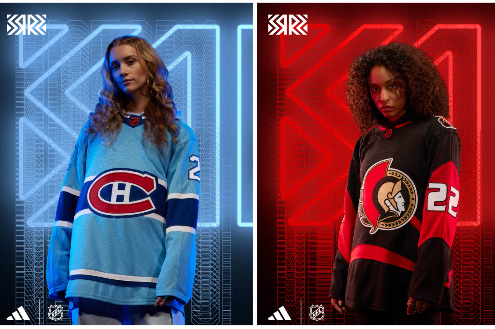
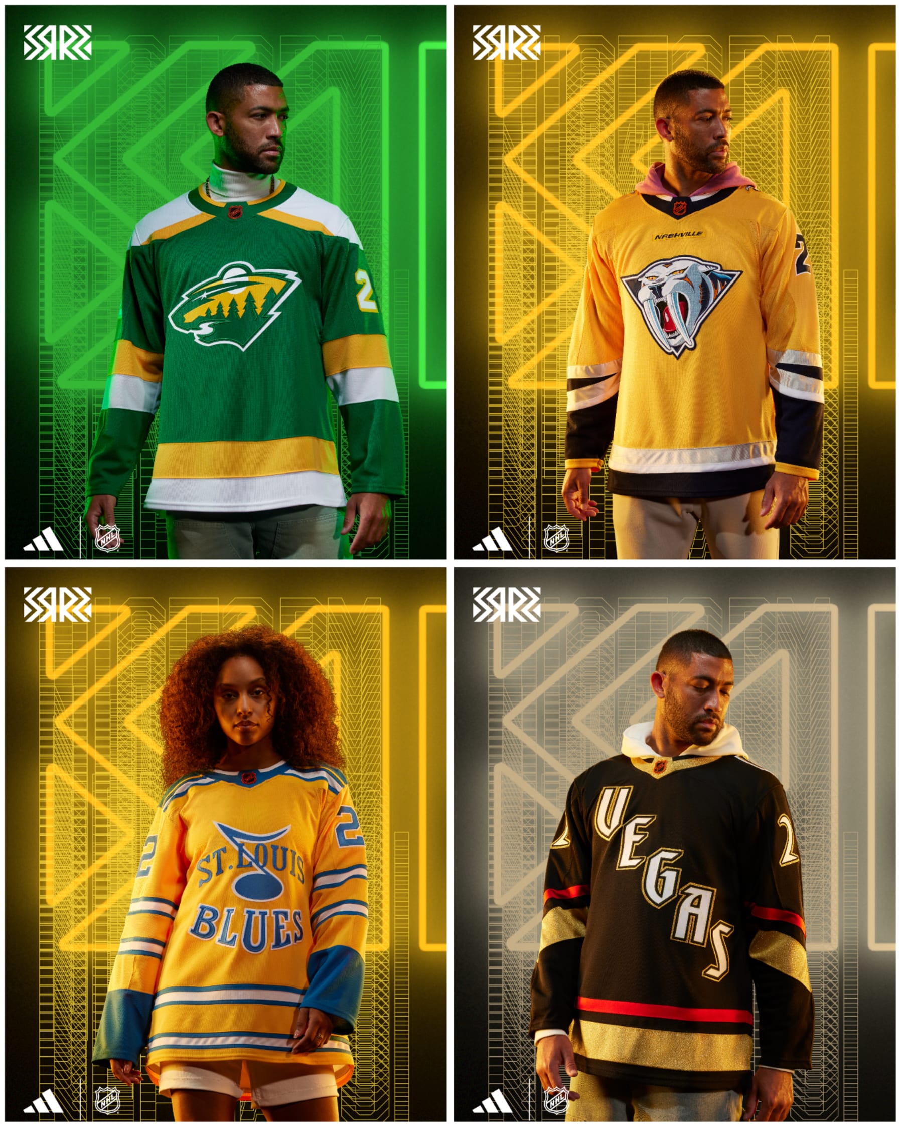
5. The Retro Reverse Jerseys
The NHL released its latest set of alternate jerseys via Adidas last week, and it might be my favorite batch of jerseys the league has ever put together. Between the Panthers' ode to Florida, the Bruins' ode to the Pooh Bear and the Tampa Bay Lightning's ode to a throwback so bad that it's good, I was thoroughly impressed. I loved that teams were branching out and giving the people what they actually want. More fun, please!
And just like that, the playoffs are only 173 days away. OK, the NHL's regular season hasn't reached the point where postseason berths are being clinched and...
1 Word About Every NHL Team's Reverse Retro Jersey
Oct 20, 2022
Nothing brings hockey fans together like the release of a
team’s new jersey. Everyone gets to play the part of amateur fashion critic and
rave about how great it is or crack jokes about how incredibly poor the result is.
A good time is had by all, and that’s all you can ask for these days.
The Reverse Retro jerseys from Adidas were introduced in
2020 and for all the ones that blew us away with how well done and reverent
they were, there were a few that missed the mark. Adidas returns this year with
a new batch of Reverse Retro sweaters, and we could write tomes for days about
the best and worst ones and never get bored with it.
But there are 32 teams in the NHL now and that would be a
lot of writing, so we’re going to try for a challenge and use one word to
describe each of the new jerseys. One thing that’s for sure is you’ll have a
lot more (colorful) words to use for them.
Eastern Conference
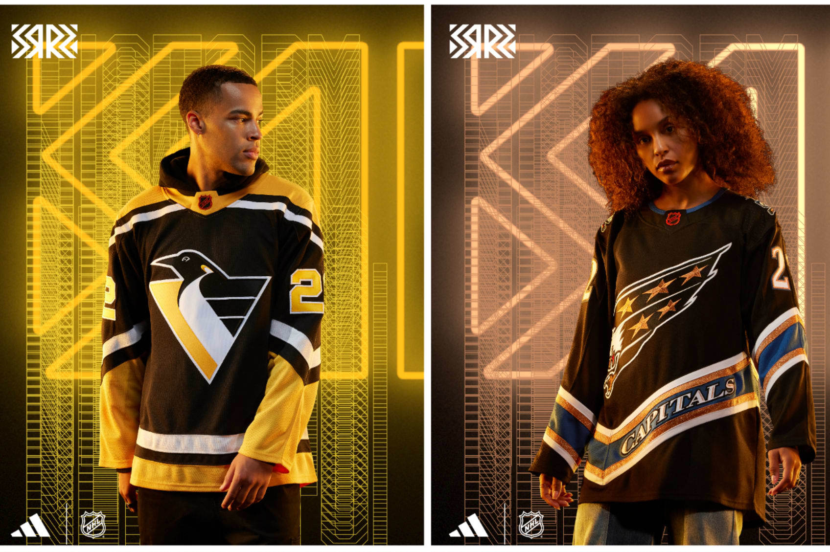
Pittsburgh Penguins: Robotic
If you missed out on seeing the Penguins from 1992-2002, boy, you missed a lot: Mario Lemieux, Jaromír Jágr and the RoboPen. The Pens switching from the skating penguin to the triangular emperor penguin made it OK to change an iconic logo into another look beloved by a generation.
The Retro Reverse is a black version of the home jersey from back then, and it's a simple color flip that rocks.
Washington Capitals: Screaming
We're in a full-on revival of the 1990s in general, but the Capitals bringing back the screaming eagle that adorned their jerseys from 1995-2007 and putting it in black as opposed to the blue/teal type color they rocked on their way to the Stanley Cup Final in 1998 looks like the final form it was meant to have.
The Caps did have a black third jersey then, but it featured a copper-like Capitol Building. Kids love buildings, right?
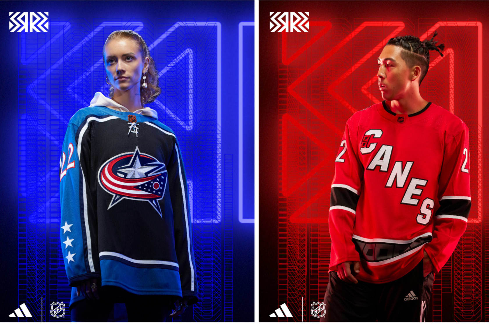
Columbus Blue Jackets: Why
This Retro Reverse jersey takes a spin on a third jersey they introduced in 2003 that eventually became their home look (in a tweaked style under Reebok). I get it: There's not a lot you can do when you're the Blue Jackets (although they did go red in 2021's Reverse Retro jersey), but picking a jersey from when the team retired Stinger from its jersey is rude and dull.
Embrace chaos: Go neon green next time.
Carolina Hurricanes: Warning
If you were keeping close tabs on Reverse Retro "leaks," then this one may have been a surprise.
They went with the Whalers logo before but kept it in-house this time, and it's fine. It's very red, and incorporating the old warning flag on a hockey stick shoulder logo is sweet, especially since it has the correct hurricane warning flags this time (two flags means hurricane, one means tropical storm). And now you've learned something.
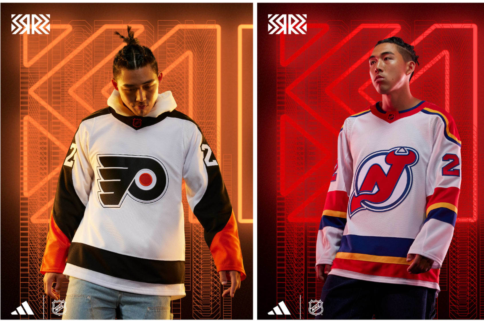
Philadelphia Flyers: Simplicity
It's not hard to make a really good-looking Flyers jersey. Taking a classic look like they had in the mid-1970s and bringing it back in 2010 for the Winter Classic, then having kept a modern version of ever since and turning the colors inside out is perfect.
It's just enough of an alteration to look different and yet retain the Flyers integrity. Inte-gritty? Sure, why not.
New Jersey Devils: Lookout
The Devils' history in New Jersey isn't teeming over with various looks to work with. Thankfully, the Devils used to be in Kansas City, so scouting out inspiration was easy. Don't hate me—you'd make the same pun.
Using the Scouts' colors and home-jersey design from the '70s as inspiration with the classic Devils logo is jarring initially but very cool.
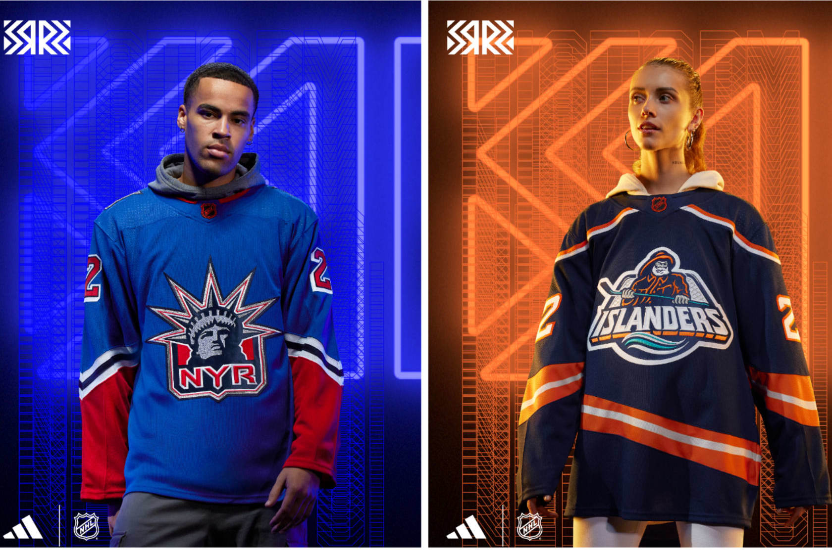
New York Rangers: Familiar
I can't fault the Rangers for running it back once again with the Lady Liberty "NYR" logo. It's incredible and should proliferate as much as possible. This iteration better resembles their '90s look but with the actual Rangers blue as opposed to navy blue and red.
It's nice and looks beautiful, but it's an all-too-familiar look. They'll also sell a zillion of them because that look is great.
New York Islanders: Angling
Last time around with Reverse Retro, the Islanders did not heed the assignment and essentially had a slightly different colored home jersey. BORING. This time around, they completed the bonus work.
The Fisherman is back, albeit with far less teal and a deep navy blue and no waves as the hem. Sure, you can nitpick the differences, but listen, the crusty old salt is back and snarling and ready to trap once again. Good luck getting one of your own.
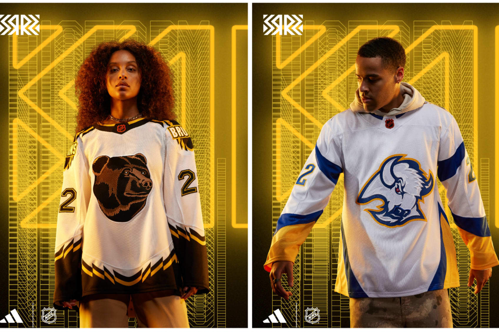
Boston Bruins: Pooh
Bless the '90s, friends. When the Bruins unleashed the golden "Pooh Bear" third jersey, it was ripped endlessly for how tame the bruin looked on the front, the bold wordmark on the shoulders and the jagged edge stripes.
But what once was old and hated can be new and beloved, and when you throw "Pooh" on a white jersey, it sticks. Love or hate the silly old bear, it looks really cool.
Buffalo Sabres: Goat
Sabres fans have clamored for many things over the past decade-plus, but bringing back the "goat head" jersey was something everyone wanted, especially when the Reverse Retros were first released.
Wishes do come true. Fans are getting double the goat head with a red-and-black throwback and this snazzy blue-and-gold iteration. All goat head, all the time.
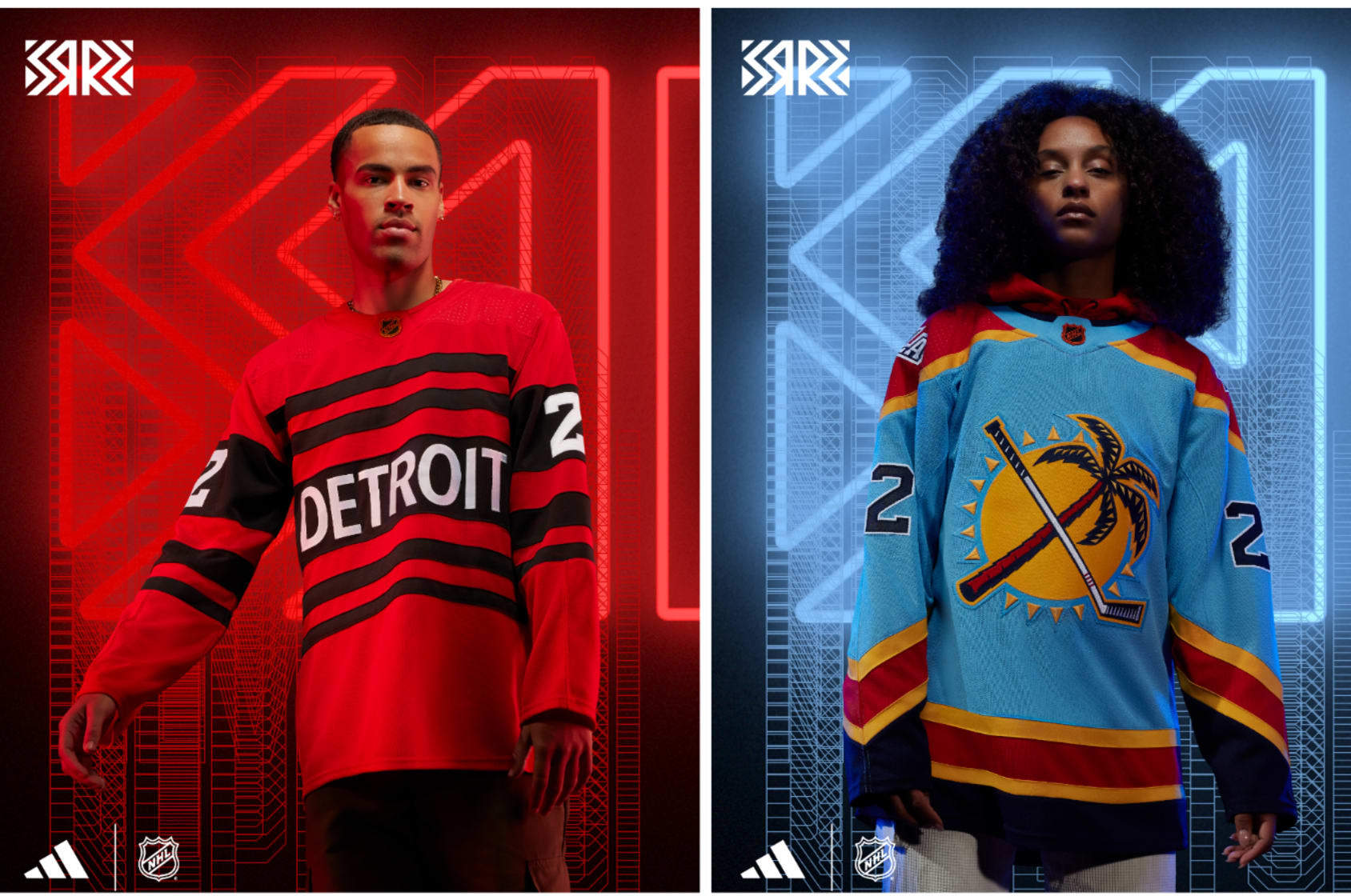
Detroit Red Wings: Candy
The Red Wings brought back the peppermint candy-like sweaters from the late 1920s (when they were called the Detroit Cougars) once before in the NHL's 75th anniversary season in 1991-92.
This time around, the stripes are back and so is "DETROIT" in all-caps but now it's red and black. Taking something really old and making one change to make it instantly modern is so easy, and it works great.
Florida Panthers: Fashion
For so long, the Panthers have had a perfect secondary shoulder logo with a palm tree and hockey stick crisscrossed in front of the sun. None of those three things have anything to do with an actual panther, but good logos deserve love. At last, this one gets its love with a sky-blue jersey.
That color comes from a short-lived third jersey from 2009-12 as well as the "FLA" shoulder logo from that. Those things plus the '90s stripes from their Stanley Cup Final look in 1996 makes basically for an all-in-one franchise-jersey history.
Montréal Canadiens: Exposition
The only question that came to mind seeing this baby blue beauty was how Andre Dawson, Rusty Staub or Gary Carter would look in it. It's the same design as the Habs' home sweater—but with colors that pay homage to the long-departed Montréal Expos baseball team.
Messing with a classic look like Montréal's has been a cardinal sin on most occasions, but...when you're bringing back memories of a once-beloved team, it gets full marks and makes us want to see Tim Raines tear up Olympic Stadium again.
Ottawa Senators: Amalgamation
The Senators haven't had too many different looks through their history, but this Reverse Retro made me do a triple take.
Yes, it's the old/current crest logo on the front. Yes, it's the jersey pattern, numbers and font they put in place from 1997-2007. Yes, that's the almost-too-real-looking 3-D Roman senator that was on the front of those jerseys on the shoulder of this one.
"Franken-jerseys" are usually too scary to confront, never mind wear, but embracing black and red like this makes it look really slick. However, it's tough for them to top what they did with their first Reverse Retro.
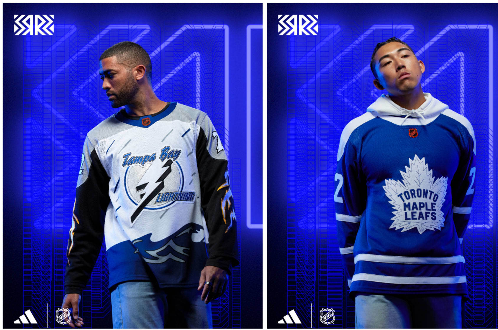
Tampa Bay Lightning: Torrential
Seeing so many of the then-reviled third jerseys of the late '90s make a comeback thanks to Reverse Retro styles gives me the warm fuzzies as a jersey collector of sorts.
The Lightning bringing back the "Stormy" third jersey that made so many people wonder what the heck was going on with it is great. Like Anaheim bringing back Wild Wing with their Reverse Retro in 2021, embracing the questionable jerseys of your history is the best way to rally the fans.
Putting the Stormy jersey in white and keeping the lightning bolts down the sleeve is way too good.
Toronto Maple Leafs: Nostalgia-ish
You have to feel for the Maple Leafs when it comes to doing something unique and different with their jerseys. There aren't too many ways to go about it without going out of bounds with a look. They've done just about any kind of iteration of a Leafs jersey possible, and their gray Retro Reverse jerseys in 2021 fell flat.
This is a clean look and just a touch different than jerseys from the past. It's nice...it just doesn't grab you by the face and demand your attention.
Western Conference
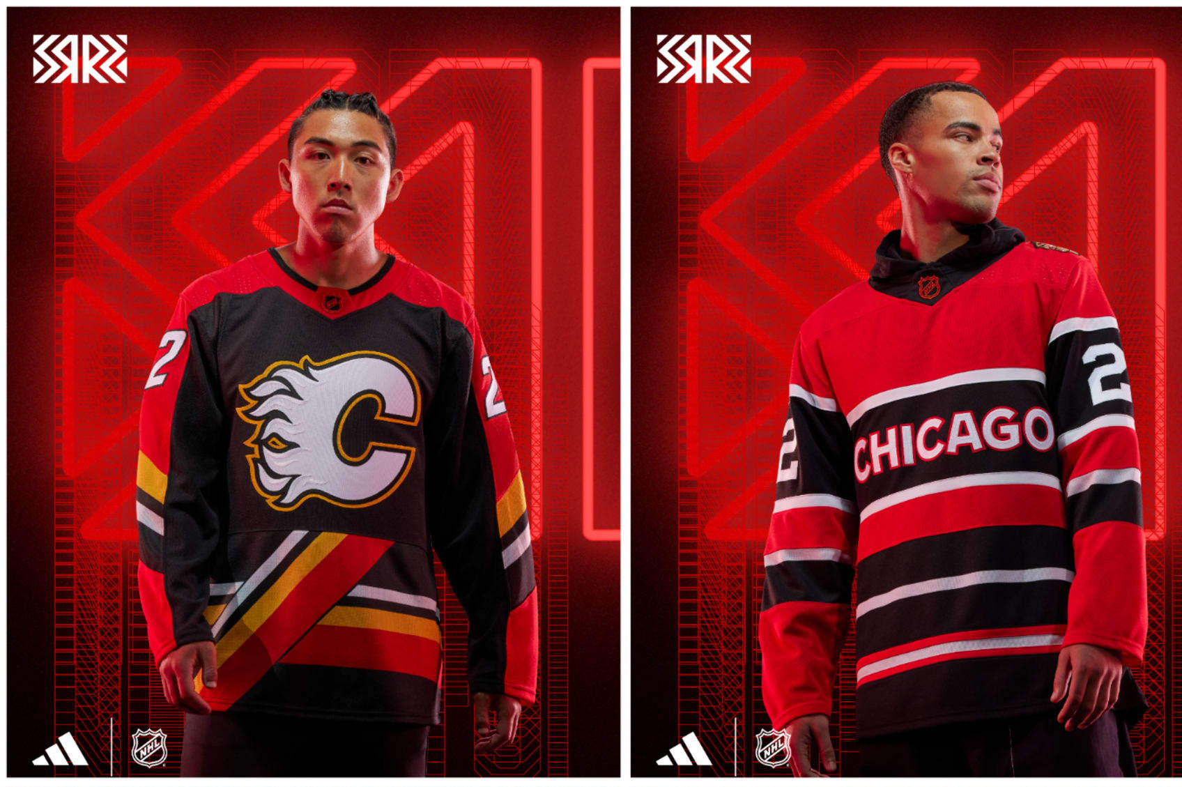
Calgary Flames: Pedestal
When the Flames brought "Blasty" the horse back for Reverse Retro in 2021, it set a really high bar to get over this time around. Bringing back a look from 1995-2000 is a noble effort. The "pedestal" striping along the bottom is quite an acquired taste and it seems there's no middle ground on opinions.
If you loved it the first time around, chances are you love this version in black. The original red-and-white iterations of it always seemed a bit "off"...but in black? It looks pretty rad to me.
Chicago Blackhawks: Marquee
The Blackhawks have steered away from using the team logo—considered by many to be a harmful and offensive caricature of Indigenous people—as the crest when it comes to Reverse Retro style, but they put it on the shoulder of this jersey that looks kind of like a marquee. The striping is unique to anything they've ever worn, but reminiscent of their jerseys from the mid-'30s through the '50s and their 2009 Winter Classic jersey.
What Hawks fans will probably not like is how it looks eerily similar to Detroit's Reverse Retro this year. Chicago has been in so many special events that coming up with something unique is almost necessary. This jersey scratches that itch, but that's about it.
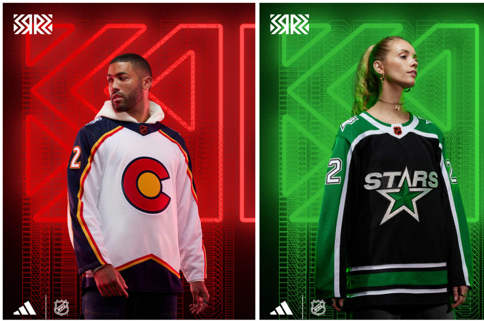
Colorado Avalanche: Rocky
Hey, it's another reference to a team that became the New Jersey Devils. That's awkward for the Avalanche. Denver has an NHL history, but it doesn't belong to the Avs. That said, the Colorado Rockies of the NHL had superb colors and the "C" of the Colorado state flag. It screams the 1970s and that's OK.
Using those colors and the "C" with the style of the original Avalanche jersey just works. Once they're done using these jerseys, they should turn it into the new state flag. It looks bold and clean, and it very carefully doesn't use the old Rockies logo.
Dallas Stars: Reunion
When the Minnesota North Stars moved to Dallas, they changed their jerseys and that original white jersey with the sleeve lines, and the state of Texas logo with a star and capital "D" took its place.
In a true Reverse Retro move, they took that jersey and flipped the colors. A black jersey with green sleeves and white lines makes it a nearly perfect replication with flipped colors from the days they skated at Reunion Arena and showed that the NHL was there to stay in Dallas.
Minnesota Wild: Polaris
In 2021's Reverse Retro campaign, the Wild were able to create a white Wild jersey with all the accouterments of the North Stars. The colors and jersey design were all from back in the day when they skated in Bloomington at the Met Center. It was a huge hit, and Wild fans could not get enough. Why mess with a good thing?
This time around it's a green jersey done in the style of the North Stars jerseys from 1978-88. It's gorgeous, it's wonderful, and it once again makes me wish the Wild were named the North Stars because what's better than our own nostalgia?
Nashville Predators: Condiment
The Predators' "Grey Poupon" third jersey from 2001-07 with the cartoonish saber-tooth tiger was routinely panned for mostly the color but also how the color with the logo just didn't really connect. Thankfully, the Preds decided to ask the question: What if we just took that jersey and changed the shade of yellow?
And the answer to that is: Yes, please do that. And they have. Nashville embracing the bright yellow has been a wonderful development over the past few years and taking this infamous third jersey and making it brighter is perfect. Their 2021 Reverse Retro jersey is nearly impossible to beat, but this is close to perfect as well.
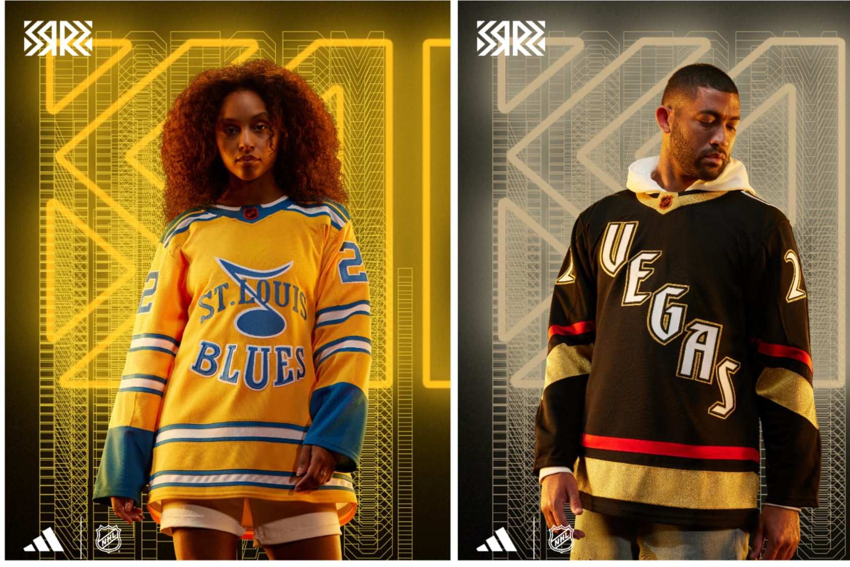
St. Louis Blues: Shiny
Speaking of teams embracing yellow, hello St. Louis! This throwback-esque jersey looks like it lifted a long-ago style with the striping everywhere and the blue note logo and the word marks leave no secret as to which team this belongs to. The logo was the Blues' prototype when the team was founded but was changed when they officially started play in 1967.
Throwing that on a bright yellow jersey makes it pop loudly, and the stripes make it seem like something older than the late '60s. It might not resonate a ton outside of St. Louis, but it looks good and has a historical background.
Vegas Golden Knights: Stardust
The Golden Knights have shown they don't fear doing things differently. Gold jerseys with shiny gold helmets aside, coming up with a Reverse Retro for a team that's been around six years is mostly an excuse to get really creative.
The diagonal wordmark along with the number font immediately made me think of classic Las Vegas casinos and for good reason. The "Vegas" font on the front is that of the Excalibur Hotel and the numbers are from the Stardust. Finding a way to bring the bright, brash signs that would lure you in to blow your cash when cruising the Strip to a jersey is fantastic. Would it be more fun if it wasn't a black jersey? Maybe, but then the glow-in-the-dark letters and numbers on the Reverse Retro might not have the same effect. Touché, Adidas.
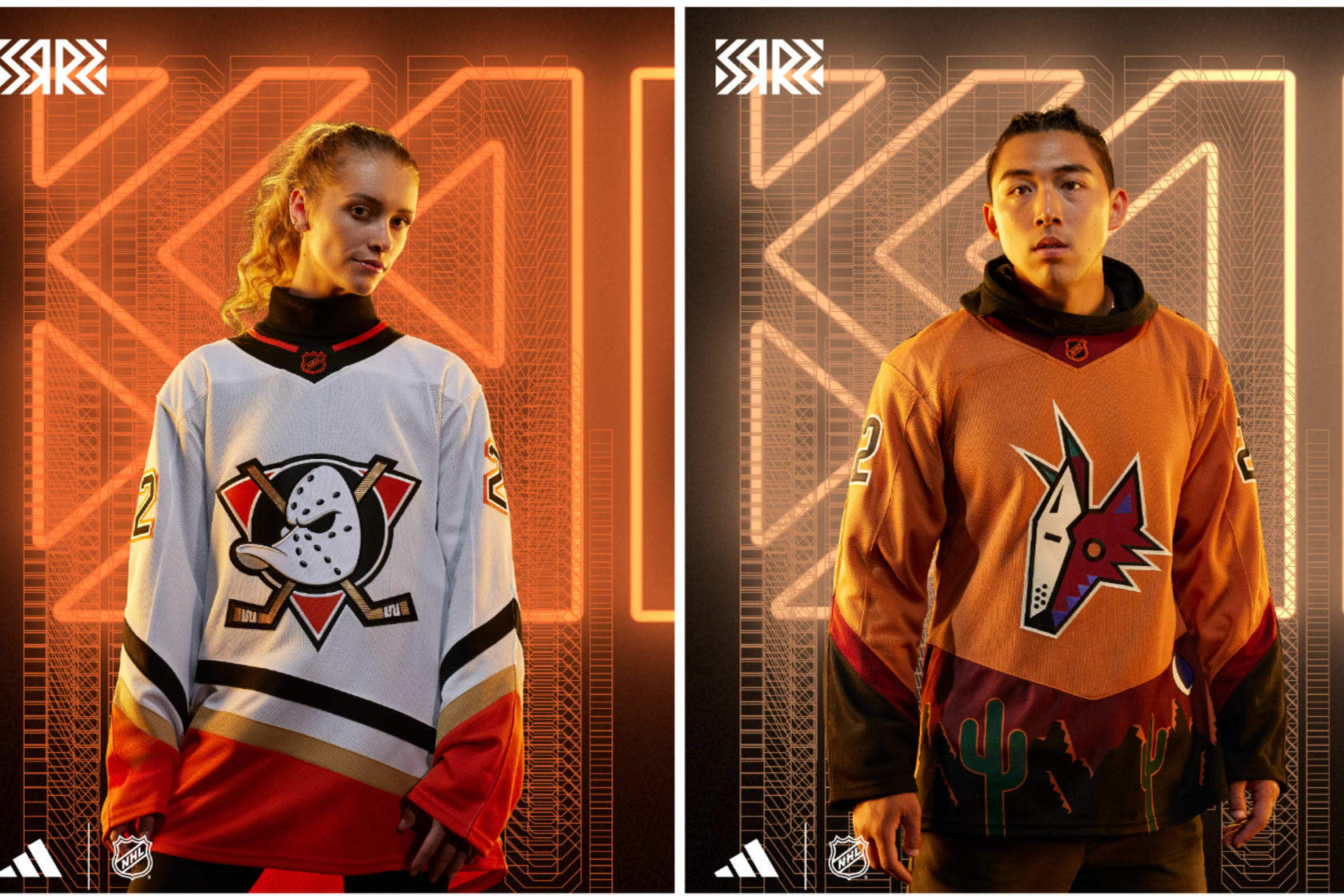
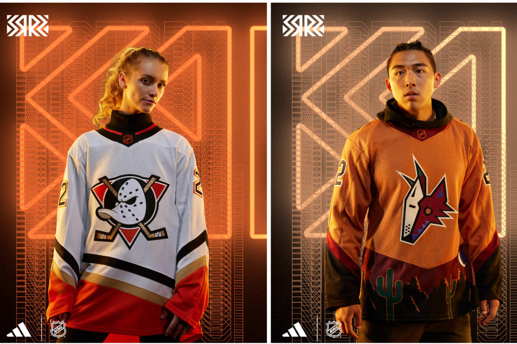
Anaheim Ducks: Classic
The original Mighty Ducks of Anaheim jerseys were perfect. The teal, plum and white colors popped, and oh yeah, there were the Disney movies. The goalie duck mask with crisscrossed sticks logo is as good as it gets, and bringing that back as much as humanly possible is the 100 percent correct move.
They've done it with their third jerseys, and now they're bringing it back for Reverse Retro, only with the current orange, black and copper colors. My suggestion: Go back to this style immediately and never look back.
Arizona Coyotes: Dusty
When the Coyotes broke out the "Peyote" coyote third jersey from 1998-2003, the main question people had was: What...is even happening? Fair question, but taking inspiration from their Kachina logo and turning it into a panorama for a jersey was inspired. The 2021 Reverse Retros in purple were fantastic.
Going back to the well is usually a reason to be critical—but not with this design. The sunset orange with red and brown makes for a super change from the original purple from 2021. This actually looks like the desert, which makes it an instant upgrade. A perfect 10.
Edmonton Oilers: Respawn
The Oilers are guilty of messing with a good thing far too often when it comes to their jerseys. Their 1980s white-and-blue jerseys are perfect, but I get it—sometimes teams need to do something different to make money.
When they had Todd McFarlane—huge Oilers fan, comic book artist and creator of "Spawn," design a third jersey to take them into the new millennium, what he concocted was so different than anything they had before. It also seemed like something from 100 years in the future.
Taking that exact look and adding a color other than dark blue or gray to highlight the oil drop and on the stripes makes this a huge upgrade on a unique original.
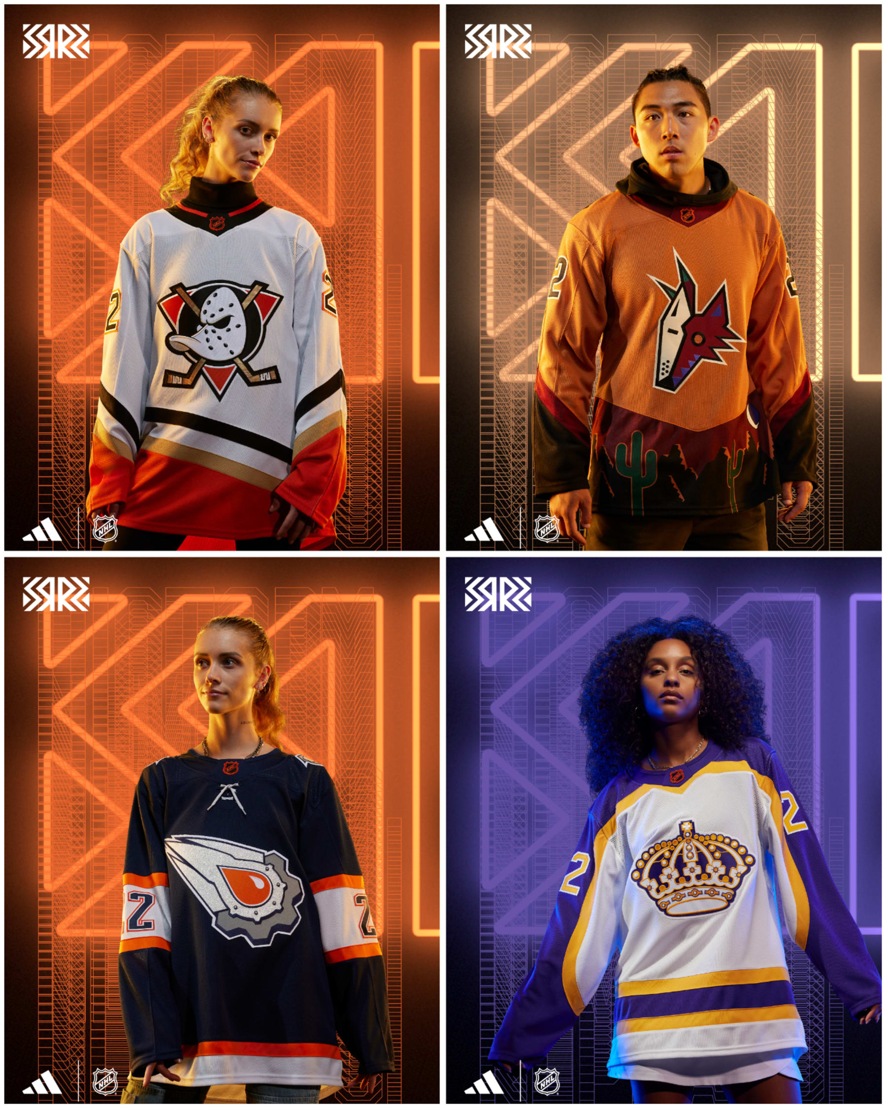
Los Angeles Kings: Regality
How is it that every time the Kings break out something from the past, it's almost always perfect.
Kings jerseys from 1980-88 were Forum Blue and gold like the Lakers, but they never were in white. The Lakers fixed that for themselves years ago, and now the Kings have their own version of it, and my goodness, it's glorious.
The crown is opulent, the Forum Blue sleeves against the white jersey just pop. Every time we see the crowns come out, it makes us wonder why they ever changed, and this makes that pang even stronger.
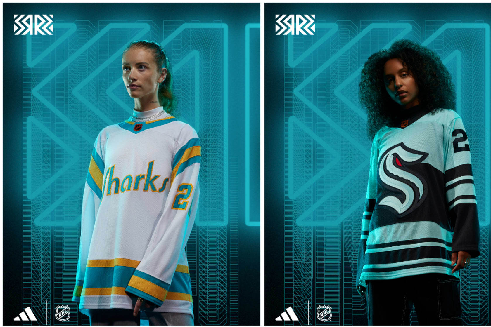
San Jose Sharks: Homage
The Sharks weren't the Bay Area's first NHL team; that honor belongs to the California Seals and that's who the Sharks are paying tribute to with these style-perfect throwbacks. This jersey is made up just like their home sweaters in the team's final years in Oakland just with "Sharks" across the front as opposed to "Seals."
Better to be the hunter than the hunted, right? The Sharks might not be playing well on the ice, but they're going to look really good with their new home and away uniforms and now this throwback beauty.
Seattle Kraken: Newfangled
It's the Kraken's first go-round in the Reverse Retro game, and well, listen, it's OK. There's a lot more sea green with this setup and a lot of stripes to make it feel old-timey.
Somehow the Kraken logo appears to have gotten even bigger on the front of this jersey, which in itself is an impressive feat of stitching technology. Going straight to a full-blown recreation of the Seattle Metropolitans (Seattle's original NHL team from 1915-24 and Stanley Cup winners in 1917) sweaters but with Kraken branding feels like something that's going to be done at some point, and I cannot wait for that.
Vancouver Canucks: Hipster
The Johnny Canuck logo is an all-time fun emblem. He's got a flannel shirt on with a toque, and he's got a sick beard. He'll help cut down trees and recommend you a great beer all at the same time. The original blue, white and green colors are great, although I thought we were done with putting numbers on the front of the jersey.
Regardless, it's got a historical throwback feel to it with the number font and just a good look. Is it awkward that the Canucks' AHL team in Abbotsford, British Columbia, uses Johnny Canuck as their full-time logo and jersey crest? Does it matter when it looks cool?
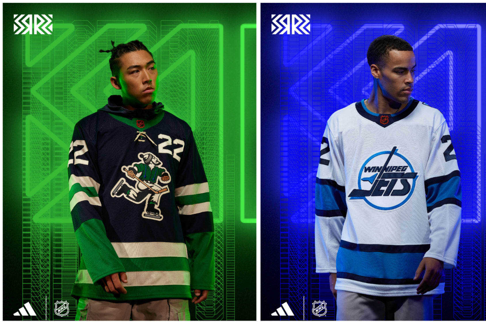
Winnipeg Jets: Frostbite
The original Jets jerseys from 1990 until they moved to Phoenix in 1996 were some of the cleanest, best-looking sweaters of all time. The stripes were simple, and the white, blue and red colors all popped on either the home white or road blue jerseys. The logo is sublime.
This version for the modern Jets is a good representation of the deep freeze the jersey has been in since the mid-'90s. Taking that original perfect jersey and giving it the current Jets colors shows one thing: That little splash of red on the original means everything to making it look beautiful. Does the new one still look great? Of course it does—it's just a bit icier than you'd want. Next up: A Thrashers throwback. Don't deny your history!
Making Sense of the Hockey Canada Situation and How It Needs to Change
Oct 20, 2022
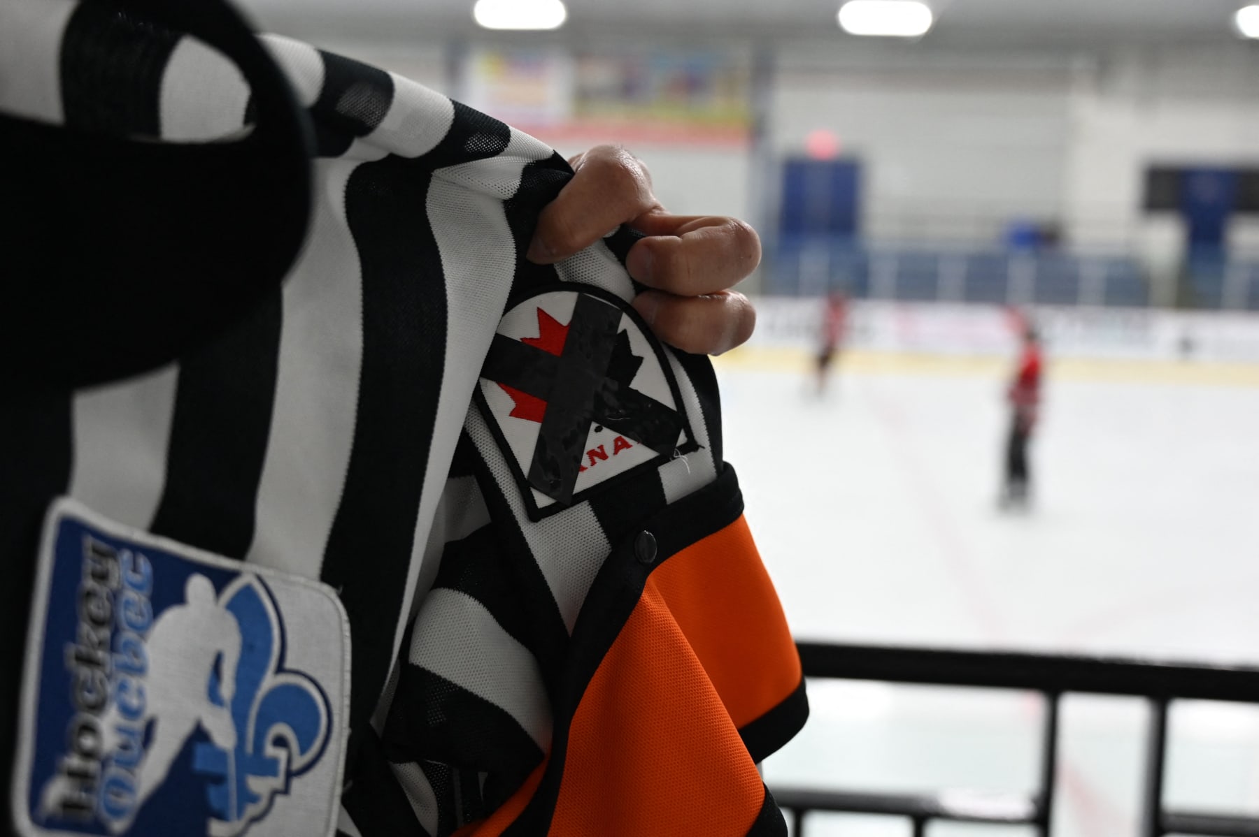
Referee Martin Pronovost wears a Hockey Canada patch crossed with black ribbon during an ice hockey game at Arena La Plaine in Montreal on June 10, 2022, to generate discussion and raise awareness as the hockey federation faces a sexual assault scandal. - True Canadian pride, ice hockey and especially its national federation are living dark hours in recent weeks, tarnished by a case of gang rape that resurfaces a culture of silence too long ignored. In May, Canadians were shocked to learn that eight players on the 2018 Junior National Team had been charged with gang sexual assault of a young woman. It was even more of a surprise when they learned that the organization supposedly overseeing them had allegedly tried to cover up the case by entering into a confidential multi-million dollar settlement with the victim. (Photo by Mathiew LEISER / AFP) (Photo by MATHIEW LEISER/AFP via Getty Images)
Hockey Canada's mishandling of a 2018 sexual assault allegation has prompted an overhaul of the organization's leadership and sparked discussions about how to change the culture of hockey.
Many are left wondering how Hockey Canada can restructure in a way that best prevents this from happening again, or if that's even possible within the current culture. To consider the options, we need to make sure we understand the nuances of the situation. And to do so, we've called upon The Athletic's investigative reporter Katie Strang, who has been an authoritative voice throughout the investigation, and To Hockey, With Love co-creator Gabriela Ugarte, who lends a unique perspective with her research in hockey culture.
Their expertise will guide us as we walk through the timeline of events leading to Hockey Canada's leadership mass exodus and assess what the future could look like.
Hockey Canada reached a settlement in May with a woman who said she was sexually assaulted by eight players, including members of Canada's 2018 world junior team. Hockey Canada announced in July that it was reopening the investigation, acknowledging in a statement that it has "not done enough to address the actions of some members of the 2018 National Junior Team, or to end the culture of toxic behavior within our game."
"I think it boggles the mind that Hockey Canada is continuing to dig in its heels," PM Justin Trudeau told reporters when asked about the organization's handling of sexual assault allegations. His comments come as Hockey Québec said it would cut ties with Hockey Canada.#cdnpolipic.twitter.com/N4qrBawFJJ
"One of the things I think get underappreciated is the way that civil litigation works in the U.S. and in Canada," Strang told Bleacher Report. "It is one of the ways alleged victims can seek recourse when they have suffered harm. People don't always understand that if you are the victim of sexual assault, you will very likely as a result of that trauma incur a great deal of expenses. Whether that's in medical bills, therapy, loss of ability to work, loss of quality of life.
"So, a lot of people have this false misconception that when someone accepts a settlement, that they were motivated by money. That's essentially a myth. It's just one of the ways our North American legal system is able to provide a level of recourse."
The reopened investigation has uncovered even more disturbing details involving multiple secret reserve funds and an intentional lack of transparency regarding settlements.
The calls for change—coming from the public, Canadian political figures and sponsors (many of which have dropped their sponsorship)—intensified in early October in light of information that Hockey Canada put player registration fees toward a second fund "for matters including but not limited to sexual abuse," according to documents obtained by The Globe and Mail. Strang reported the existence of a third fund, this one for "uninsured claims," on Oct. 17.
Former interim board of directors chair Andrea Skinner appeared before the Canadian Heritage Committee the day after The Globe and Mail's initial report, saying she "fundamentally disagrees" with the report and the way it had been categorized in the media.
Skinner made several statements in defense of Hockey Canada leadership to the committee, calling reports "substantial misinformation and unduly cynical attacks" but offering little elaboration.
"Regrettably, toxic behavior exists throughout society. No segment of society is immune," she said. "Suggesting that toxic behavior is somehow a specific hockey problem or to scapegoat hockey as a centerpiece for toxic culture is, in my opinion, counterproductive to finding solutions."
Strang disagrees with Skinner's statements: "I think just chalking it up to a greater societal problem is, in my opinion, lazy, reductive and an attempt to deflect responsibility, accountability and blame rather than show a sense of accountability and introspection about why there are certain cultural issues within the sport of hockey. ... The first step to educate about and eradicate sexual violence is to have a real, hard look at why it's taking place."
"How can someone’s argument be, 'Well, your sport abused people, so why can't it happen in ours,' Ugarte added. "The real question is, why this is so common in organized sports?"
In the days following the new findings—and Skinner's statements in the third round of Hockey Canada hearings—sponsors such as Tim Hortons, Scotiabank, Telus, Canadian Tire, Imperial Oil, Skip the Dishes, Sobeys, BDO, Recipe, Nike and Bauer pulled support in varying capacities.
Amid growing financial pressure, Skinner resigned Oct. 8, and Hockey Canada CEO and President Scott Smith and the board of directors stepped down Oct. 11.
“I certainly think the hemorrhaging of corporate dollars played a huge role in the mass exodus that we got last week," Strang said. "I think money talks, and I think the fact that so many sponsors were not just cutting ties with the organization financially, but they were taking a symbolic stance. They're saying, 'This is untenable for us to be associated with you anymore, because the reputational damage we might incur from that association is no longer worth our while.' And I think Hockey Canada finally realized the impact the past few months have truly had."
The NHL is conducting its own investigation of the alleged sexual assault that took place in 2018, but there has been no word of a resolution, only that the investigation is "closer to the end," according to deputy commissioner Bill Daly.
Hockey Canada will create an interim management committee until a new board appoints a new CEO. The board has also asked members to select an interim slate of directors until a new board is elected. The virtual election is scheduled for Dec. 17.
The role of the interim management group will be managing day-to-day operations and continuing to implement Hockey Canada's action plan.
"I'm very curious to see who is on this interim management committee," Strang said. "I feel like Hockey Canada has not been really transparent about that—I have asked them. And that makes me really wonder how much they are truly committed to infusing the organization with people who are committed to driving change, versus how much is it them trying to salvage some level of institutional continuity."
Getting rid of the old Hockey Canada leadership group was a necessary step in changing the culture, but there's still work to be done between appointing an interim group and electing a new board. What should we be looking out for as new faces emerge in the organization?
"I think the fact that this board has for a long time traditionally been comprised of older, white men is problematic," Strang said. "Not just because you're getting a real homogenous sense of perspective, but because that does not accurately reflect the demographics of the hockey-playing community in Canada." She added, "You need someone on the board that is trained and has experience in dealing with sexual violence."
Ugarte added that it goes deeper than diversity for the sake of diversity.
"We need to see people of different gender identities, race, sexuality, ability, socioeconomic backgrounds and with an array of work experiences," she said. "The board would benefit from having scholars who've studied the sport, community organizers and people who have experience working with victims of violence. Having a diverse board and staff is not just the 'politically correct' move or whatever they want to call it. It protects an organization from creating these types of insular cultures."
None of this is easy to talk about, and much of it is difficult to understand. It will take hard work at every level to change hockey culture.
"These men did not flip a switch and suddenly think it was OK to assault someone at that Hockey Canada event," Ugarte said. "That was the result of the culture they were raised in, and the bulk of that development happens in junior hockey. We need to pay more attention to organizations like the CHL that are responsible for a lot of these men during critical periods of their emotional and social development."
Loving hockey means demanding the best from it. Skinner is correct that toxic behavior happens throughout society, and sexual assault and abuse must be addressed everywhere. But I specifically love hockey, and it's clear change is necessary.
Aaaannnnnd...we're back. The NHL's 2022-23 regular season is officially underway for all 32 teams after the Nashville Predators and San Jose Sharks got a head...
NHL Investigation Finds No Evidence Against Ian Cole in Sexual Abuse Probe
Oct 15, 2022
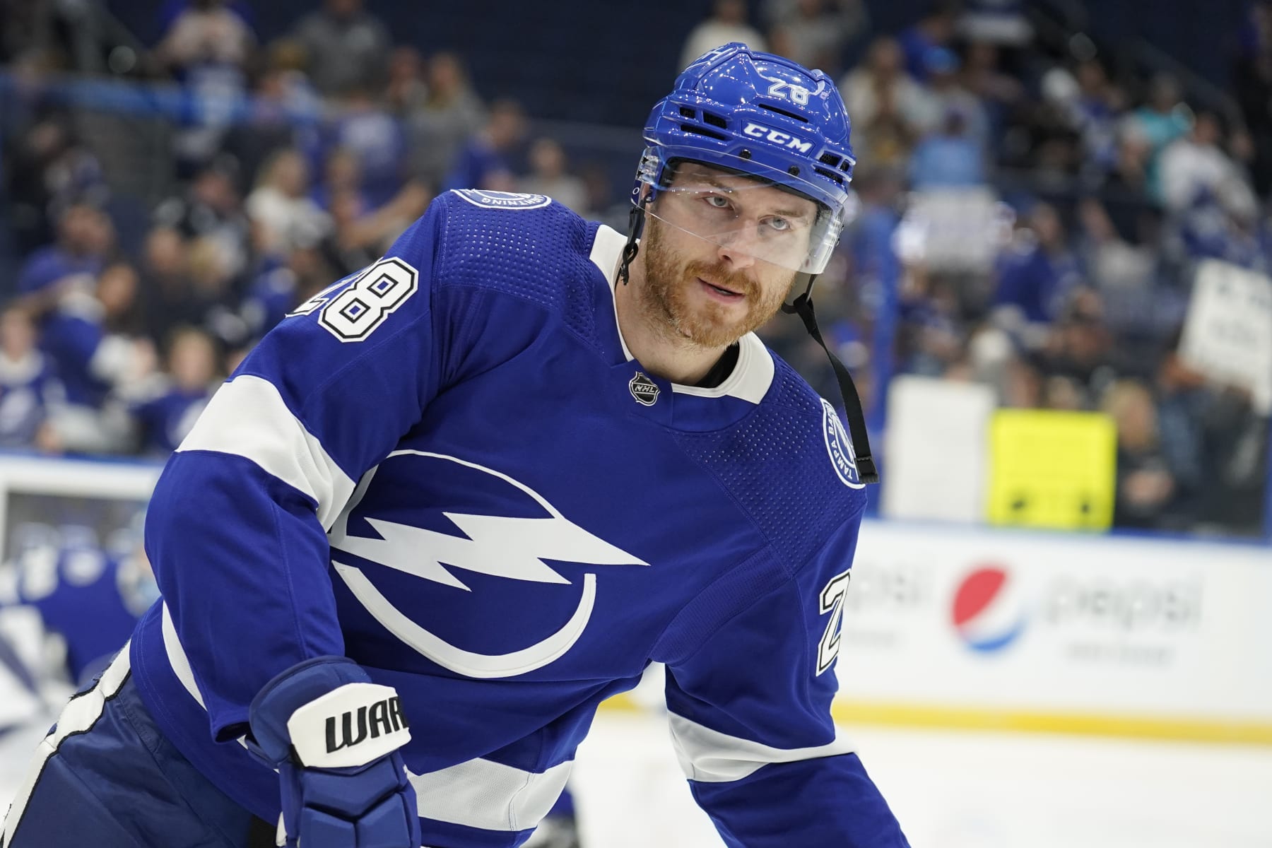
Tampa Bay Lightning defenseman Ian Cole (28) before an NHL preseason hockey game against the Florida Panthers Saturday, Oct. 8, 2022, in Tampa, Fla. (AP Photo/Chris O'Meara)
The NHL announced Saturday following an investigation that it has found no evidence to substantiate the anonymous sexual abuse and grooming allegations against Tampa Bay Lightning defenseman Ian Cole.
The NHL said in a press release:
"The investigation included two separate interviews with Mr. Cole as well as interviews with NHL club personnel and other individuals with potentially relevant information. Further, the investigation included a detailed review of on-line and social media, public data, and court records and law enforcement checks. In addition, despite attempts by the League to make contact with the anonymous source of the social media post, those efforts were unsuccessful.
"On the basis of the foregoing, the National Hockey League now considers this matter closed."
The NHL Players' Association also released a statement following the league's investigation:
The Lightning announced Oct. 9 that they had suspended Cole, pending the results of an investigation, following the allegations against him. The veteran defenseman has since been reinstated, per The Athletic's Joe Smith.
Cole also released a statement on Oct. 9 denying the allegations, adding that he was looking "forward to clearing my name and demonstrating to the NHL and the Tampa Bay Lightning that these allegations are unfounded."
On Oct. 7, an anonymous woman accused Cole of grooming and sexually abusing her over a four-year stretch that began while she was a minor in high school.
The woman accused Cole of pressuring her into having sex with him, adding that he knew she was still a minor at the time. In addition, she alleged Cole was having sexual relations with other high school-aged teenagers.
In addition, the woman alleged that Cole would "frequently pressure me to do things without consent" and that he manipulated and humiliated her and would frequently make misogynistic, derogatory comments toward her.
"Ian felt emboldened to emotionally and sexually abuse me and other women because the NHL fosters a culture of misogyny," the woman said in her statement. "The NHL needs to hold themselves and their players accountable for creating an enabling environment of misogynistic and predatory behavior."
Cole, who signed a one-year, $3 million deal with the Lightning in July, missed the team's first two games of the season against the New York Rangers and Columbus Blue Jackets. It's unclear if he will suit up for the team's matchup against the Pittsburgh Penguins on Saturday.
The St. Louis Blues selected the 33-year-old in the first round of the 2007 NHL draft. He made his NHL debut in 2010 and has also played for the Pittsburgh Penguins, Colorado Avalanche, Columbus Blue Jackets and Minnesota Wild over his 12-year career.
Since the 2020-21 season, NHL teams
have operated under a salary cap that's risen at a glacial pace.
Flattened by a reduction in hockey-related revenue brought...