1 Word About Every NHL Team's Reverse Retro Jersey
Oct 20, 2022
Nothing brings hockey fans together like the release of a
team’s new jersey. Everyone gets to play the part of amateur fashion critic and
rave about how great it is or crack jokes about how incredibly poor the result is.
A good time is had by all, and that’s all you can ask for these days.
The Reverse Retro jerseys from Adidas were introduced in
2020 and for all the ones that blew us away with how well done and reverent
they were, there were a few that missed the mark. Adidas returns this year with
a new batch of Reverse Retro sweaters, and we could write tomes for days about
the best and worst ones and never get bored with it.
But there are 32 teams in the NHL now and that would be a
lot of writing, so we’re going to try for a challenge and use one word to
describe each of the new jerseys. One thing that’s for sure is you’ll have a
lot more (colorful) words to use for them.
Eastern Conference
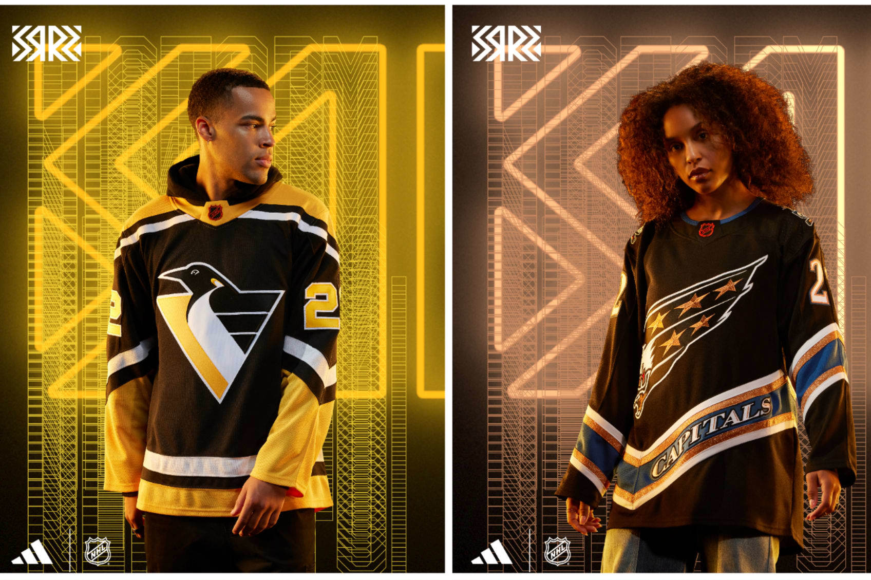
Pittsburgh Penguins: Robotic
If you missed out on seeing the Penguins from 1992-2002, boy, you missed a lot: Mario Lemieux, Jaromír Jágr and the RoboPen. The Pens switching from the skating penguin to the triangular emperor penguin made it OK to change an iconic logo into another look beloved by a generation.
The Retro Reverse is a black version of the home jersey from back then, and it's a simple color flip that rocks.
Washington Capitals: Screaming
We're in a full-on revival of the 1990s in general, but the Capitals bringing back the screaming eagle that adorned their jerseys from 1995-2007 and putting it in black as opposed to the blue/teal type color they rocked on their way to the Stanley Cup Final in 1998 looks like the final form it was meant to have.
The Caps did have a black third jersey then, but it featured a copper-like Capitol Building. Kids love buildings, right?
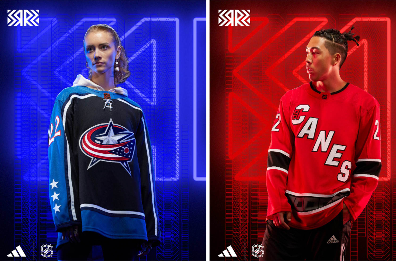
Columbus Blue Jackets: Why
This Retro Reverse jersey takes a spin on a third jersey they introduced in 2003 that eventually became their home look (in a tweaked style under Reebok). I get it: There's not a lot you can do when you're the Blue Jackets (although they did go red in 2021's Reverse Retro jersey), but picking a jersey from when the team retired Stinger from its jersey is rude and dull.
Embrace chaos: Go neon green next time.
Carolina Hurricanes: Warning
If you were keeping close tabs on Reverse Retro "leaks," then this one may have been a surprise.
They went with the Whalers logo before but kept it in-house this time, and it's fine. It's very red, and incorporating the old warning flag on a hockey stick shoulder logo is sweet, especially since it has the correct hurricane warning flags this time (two flags means hurricane, one means tropical storm). And now you've learned something.
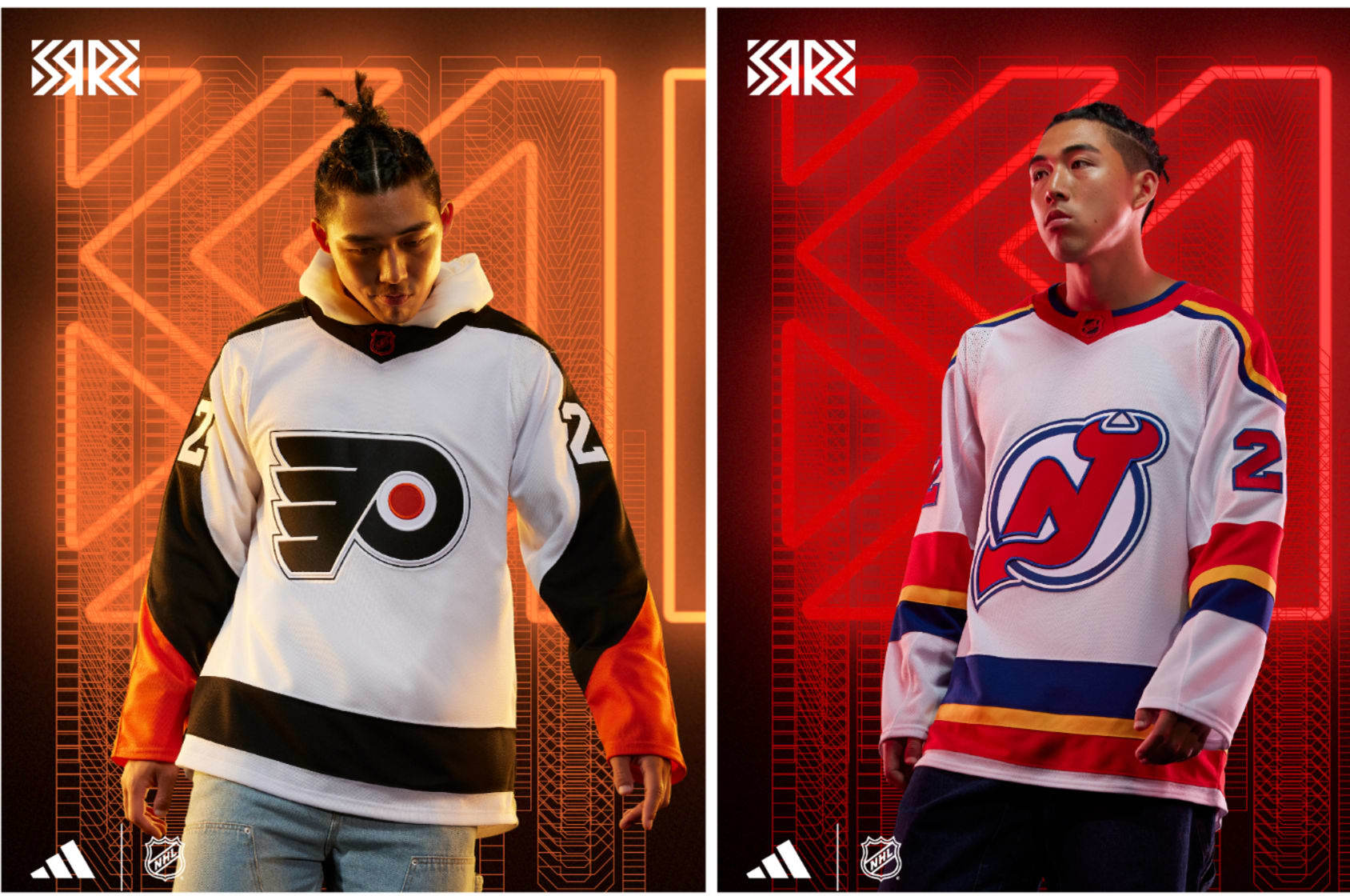
Philadelphia Flyers: Simplicity
It's not hard to make a really good-looking Flyers jersey. Taking a classic look like they had in the mid-1970s and bringing it back in 2010 for the Winter Classic, then having kept a modern version of ever since and turning the colors inside out is perfect.
It's just enough of an alteration to look different and yet retain the Flyers integrity. Inte-gritty? Sure, why not.
New Jersey Devils: Lookout
The Devils' history in New Jersey isn't teeming over with various looks to work with. Thankfully, the Devils used to be in Kansas City, so scouting out inspiration was easy. Don't hate me—you'd make the same pun.
Using the Scouts' colors and home-jersey design from the '70s as inspiration with the classic Devils logo is jarring initially but very cool.
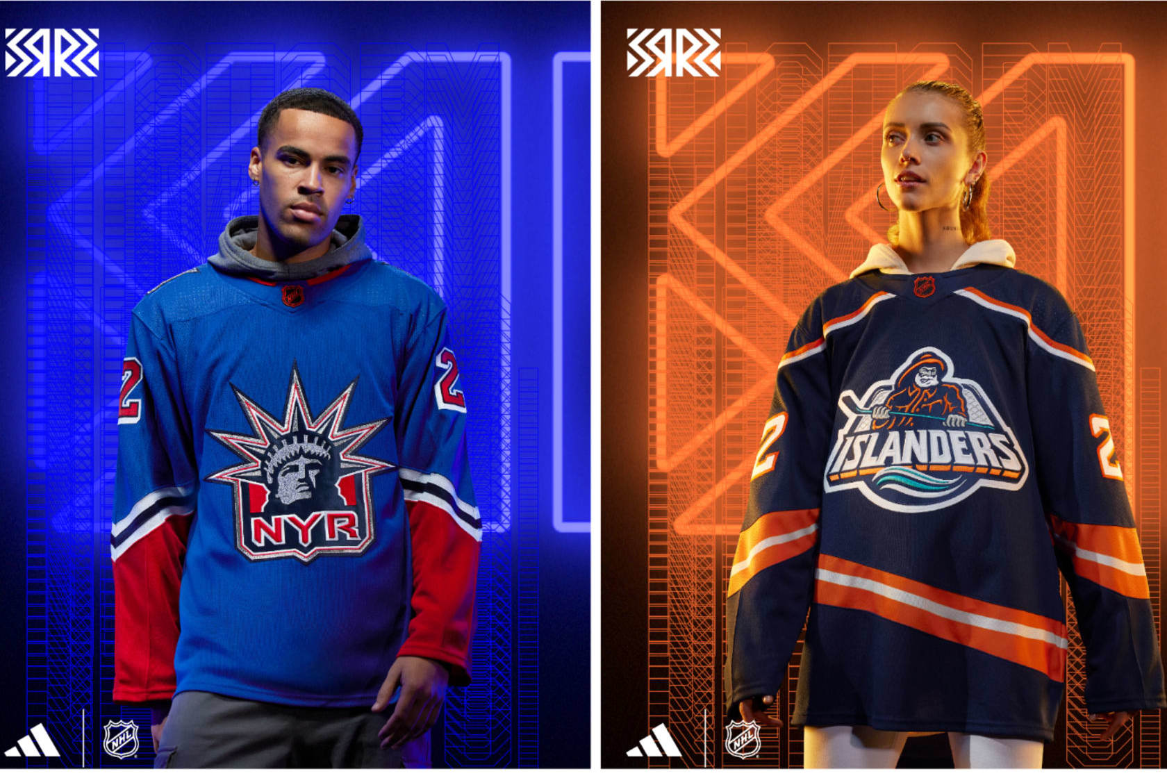
New York Rangers: Familiar
I can't fault the Rangers for running it back once again with the Lady Liberty "NYR" logo. It's incredible and should proliferate as much as possible. This iteration better resembles their '90s look but with the actual Rangers blue as opposed to navy blue and red.
It's nice and looks beautiful, but it's an all-too-familiar look. They'll also sell a zillion of them because that look is great.
New York Islanders: Angling
Last time around with Reverse Retro, the Islanders did not heed the assignment and essentially had a slightly different colored home jersey. BORING. This time around, they completed the bonus work.
The Fisherman is back, albeit with far less teal and a deep navy blue and no waves as the hem. Sure, you can nitpick the differences, but listen, the crusty old salt is back and snarling and ready to trap once again. Good luck getting one of your own.
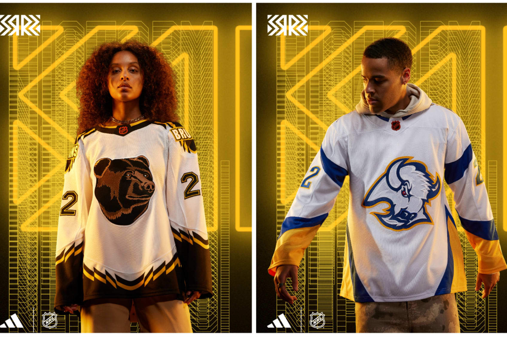
Boston Bruins: Pooh
Bless the '90s, friends. When the Bruins unleashed the golden "Pooh Bear" third jersey, it was ripped endlessly for how tame the bruin looked on the front, the bold wordmark on the shoulders and the jagged edge stripes.
But what once was old and hated can be new and beloved, and when you throw "Pooh" on a white jersey, it sticks. Love or hate the silly old bear, it looks really cool.
Buffalo Sabres: Goat
Sabres fans have clamored for many things over the past decade-plus, but bringing back the "goat head" jersey was something everyone wanted, especially when the Reverse Retros were first released.
Wishes do come true. Fans are getting double the goat head with a red-and-black throwback and this snazzy blue-and-gold iteration. All goat head, all the time.
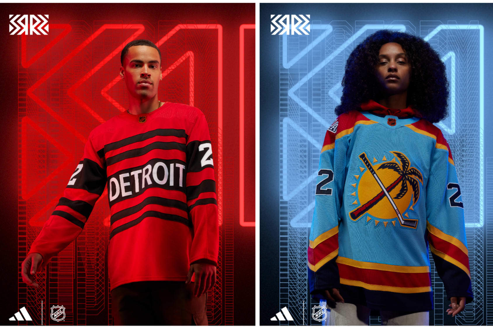
Detroit Red Wings: Candy
The Red Wings brought back the peppermint candy-like sweaters from the late 1920s (when they were called the Detroit Cougars) once before in the NHL's 75th anniversary season in 1991-92.
This time around, the stripes are back and so is "DETROIT" in all-caps but now it's red and black. Taking something really old and making one change to make it instantly modern is so easy, and it works great.
Florida Panthers: Fashion
For so long, the Panthers have had a perfect secondary shoulder logo with a palm tree and hockey stick crisscrossed in front of the sun. None of those three things have anything to do with an actual panther, but good logos deserve love. At last, this one gets its love with a sky-blue jersey.
That color comes from a short-lived third jersey from 2009-12 as well as the "FLA" shoulder logo from that. Those things plus the '90s stripes from their Stanley Cup Final look in 1996 makes basically for an all-in-one franchise-jersey history.
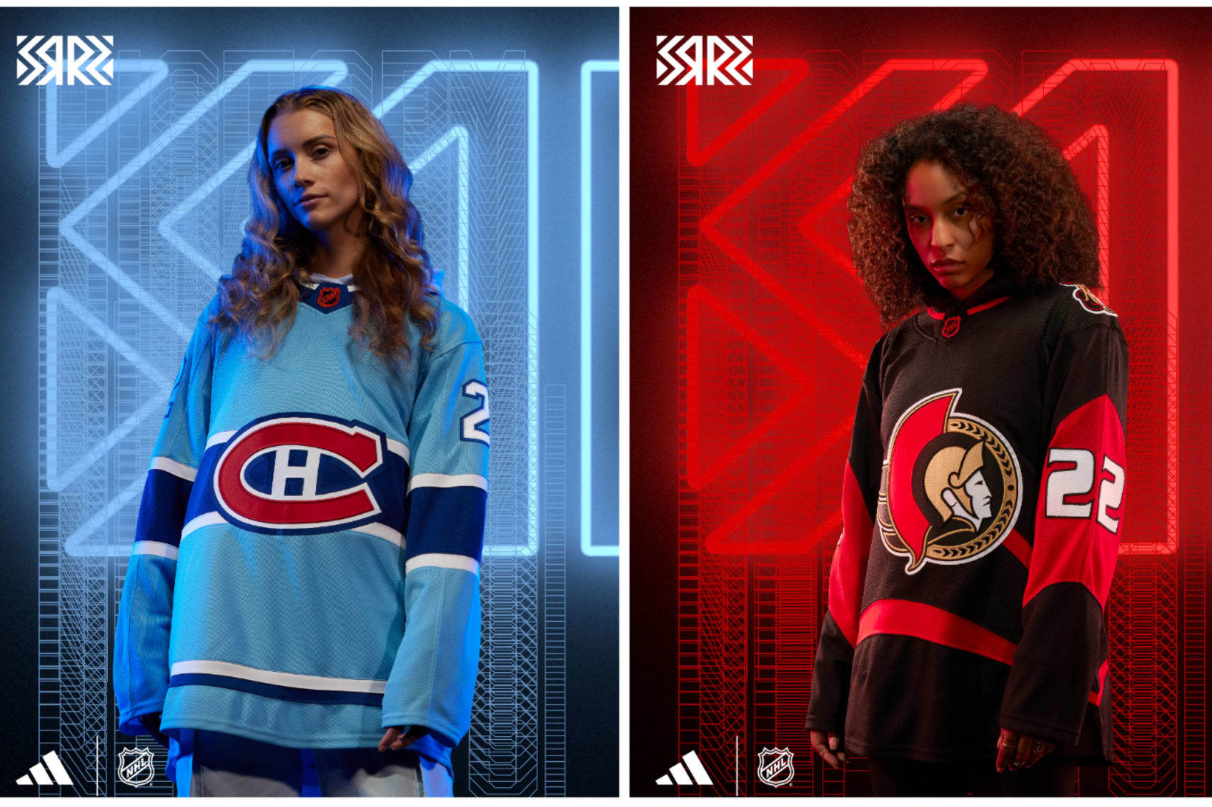
Montréal Canadiens: Exposition
The only question that came to mind seeing this baby blue beauty was how Andre Dawson, Rusty Staub or Gary Carter would look in it. It's the same design as the Habs' home sweater—but with colors that pay homage to the long-departed Montréal Expos baseball team.
Messing with a classic look like Montréal's has been a cardinal sin on most occasions, but...when you're bringing back memories of a once-beloved team, it gets full marks and makes us want to see Tim Raines tear up Olympic Stadium again.
Ottawa Senators: Amalgamation
The Senators haven't had too many different looks through their history, but this Reverse Retro made me do a triple take.
Yes, it's the old/current crest logo on the front. Yes, it's the jersey pattern, numbers and font they put in place from 1997-2007. Yes, that's the almost-too-real-looking 3-D Roman senator that was on the front of those jerseys on the shoulder of this one.
"Franken-jerseys" are usually too scary to confront, never mind wear, but embracing black and red like this makes it look really slick. However, it's tough for them to top what they did with their first Reverse Retro.
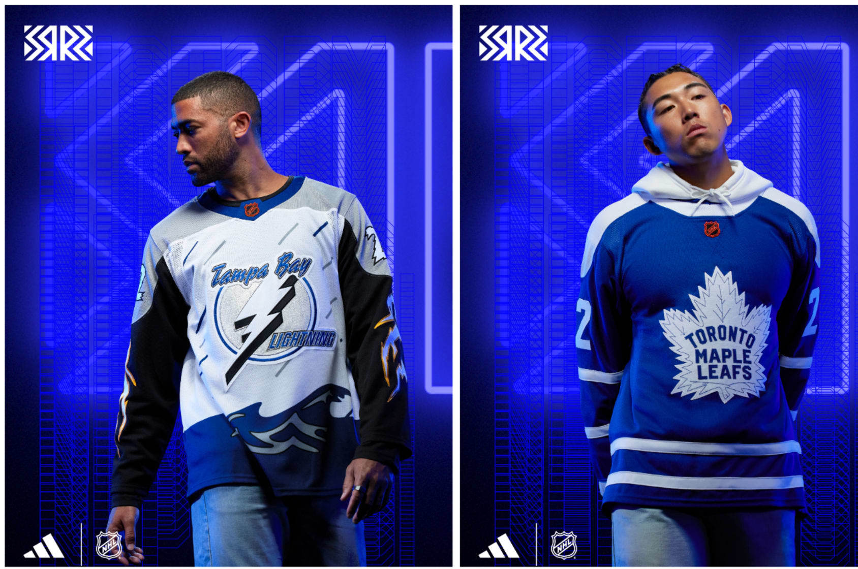
Tampa Bay Lightning: Torrential
Seeing so many of the then-reviled third jerseys of the late '90s make a comeback thanks to Reverse Retro styles gives me the warm fuzzies as a jersey collector of sorts.
The Lightning bringing back the "Stormy" third jersey that made so many people wonder what the heck was going on with it is great. Like Anaheim bringing back Wild Wing with their Reverse Retro in 2021, embracing the questionable jerseys of your history is the best way to rally the fans.
Putting the Stormy jersey in white and keeping the lightning bolts down the sleeve is way too good.
Toronto Maple Leafs: Nostalgia-ish
You have to feel for the Maple Leafs when it comes to doing something unique and different with their jerseys. There aren't too many ways to go about it without going out of bounds with a look. They've done just about any kind of iteration of a Leafs jersey possible, and their gray Retro Reverse jerseys in 2021 fell flat.
This is a clean look and just a touch different than jerseys from the past. It's nice...it just doesn't grab you by the face and demand your attention.
Western Conference
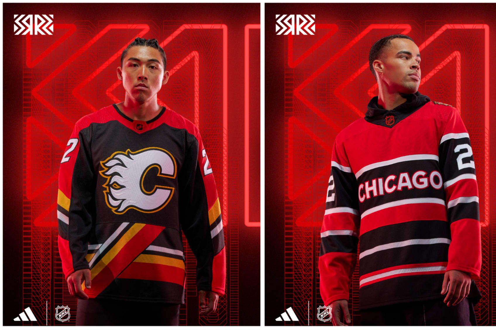
Calgary Flames: Pedestal
When the Flames brought "Blasty" the horse back for Reverse Retro in 2021, it set a really high bar to get over this time around. Bringing back a look from 1995-2000 is a noble effort. The "pedestal" striping along the bottom is quite an acquired taste and it seems there's no middle ground on opinions.
If you loved it the first time around, chances are you love this version in black. The original red-and-white iterations of it always seemed a bit "off"...but in black? It looks pretty rad to me.
Chicago Blackhawks: Marquee
The Blackhawks have steered away from using the team logo—considered by many to be a harmful and offensive caricature of Indigenous people—as the crest when it comes to Reverse Retro style, but they put it on the shoulder of this jersey that looks kind of like a marquee. The striping is unique to anything they've ever worn, but reminiscent of their jerseys from the mid-'30s through the '50s and their 2009 Winter Classic jersey.
What Hawks fans will probably not like is how it looks eerily similar to Detroit's Reverse Retro this year. Chicago has been in so many special events that coming up with something unique is almost necessary. This jersey scratches that itch, but that's about it.
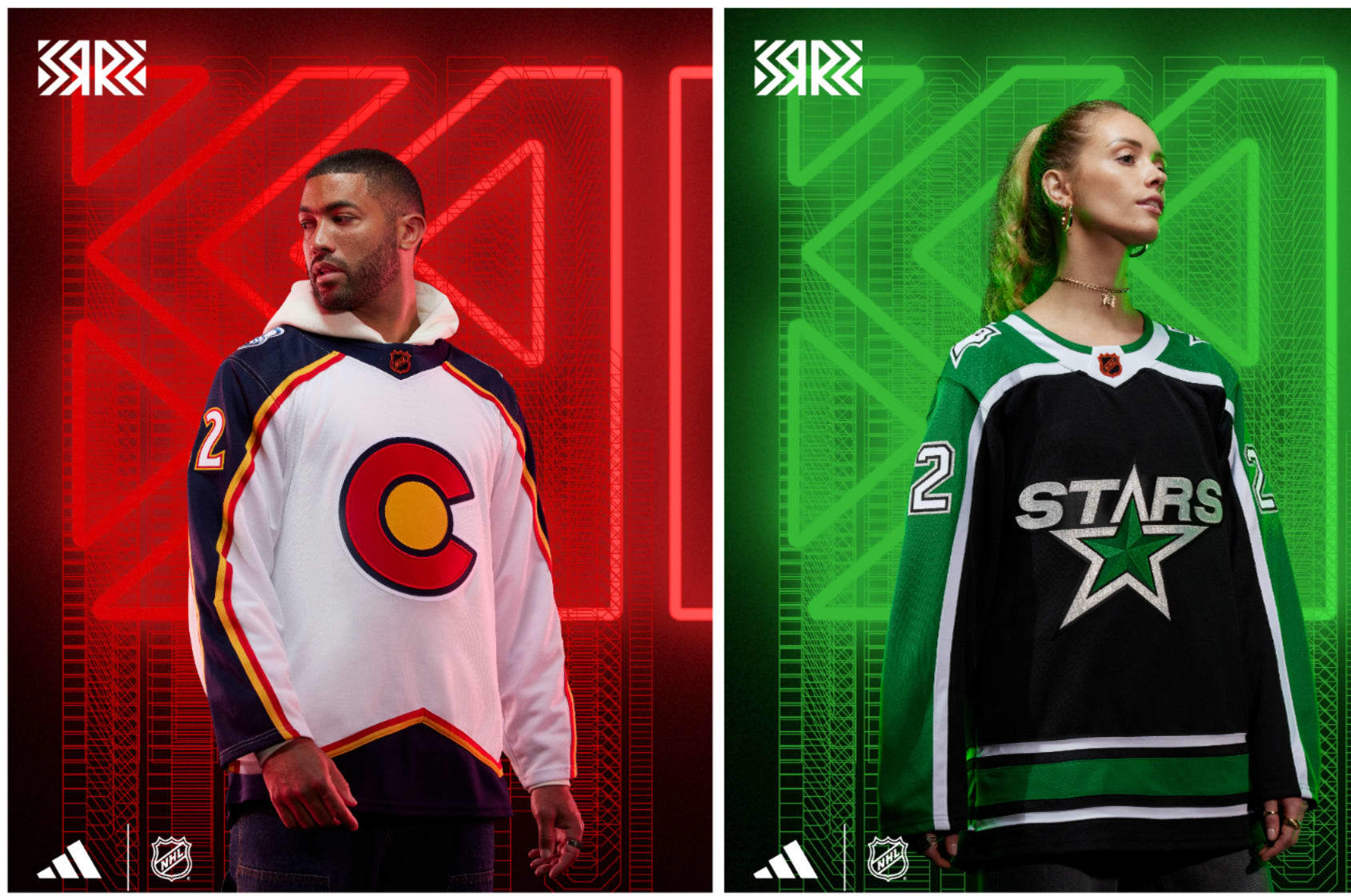
Colorado Avalanche: Rocky
Hey, it's another reference to a team that became the New Jersey Devils. That's awkward for the Avalanche. Denver has an NHL history, but it doesn't belong to the Avs. That said, the Colorado Rockies of the NHL had superb colors and the "C" of the Colorado state flag. It screams the 1970s and that's OK.
Using those colors and the "C" with the style of the original Avalanche jersey just works. Once they're done using these jerseys, they should turn it into the new state flag. It looks bold and clean, and it very carefully doesn't use the old Rockies logo.
Dallas Stars: Reunion
When the Minnesota North Stars moved to Dallas, they changed their jerseys and that original white jersey with the sleeve lines, and the state of Texas logo with a star and capital "D" took its place.
In a true Reverse Retro move, they took that jersey and flipped the colors. A black jersey with green sleeves and white lines makes it a nearly perfect replication with flipped colors from the days they skated at Reunion Arena and showed that the NHL was there to stay in Dallas.
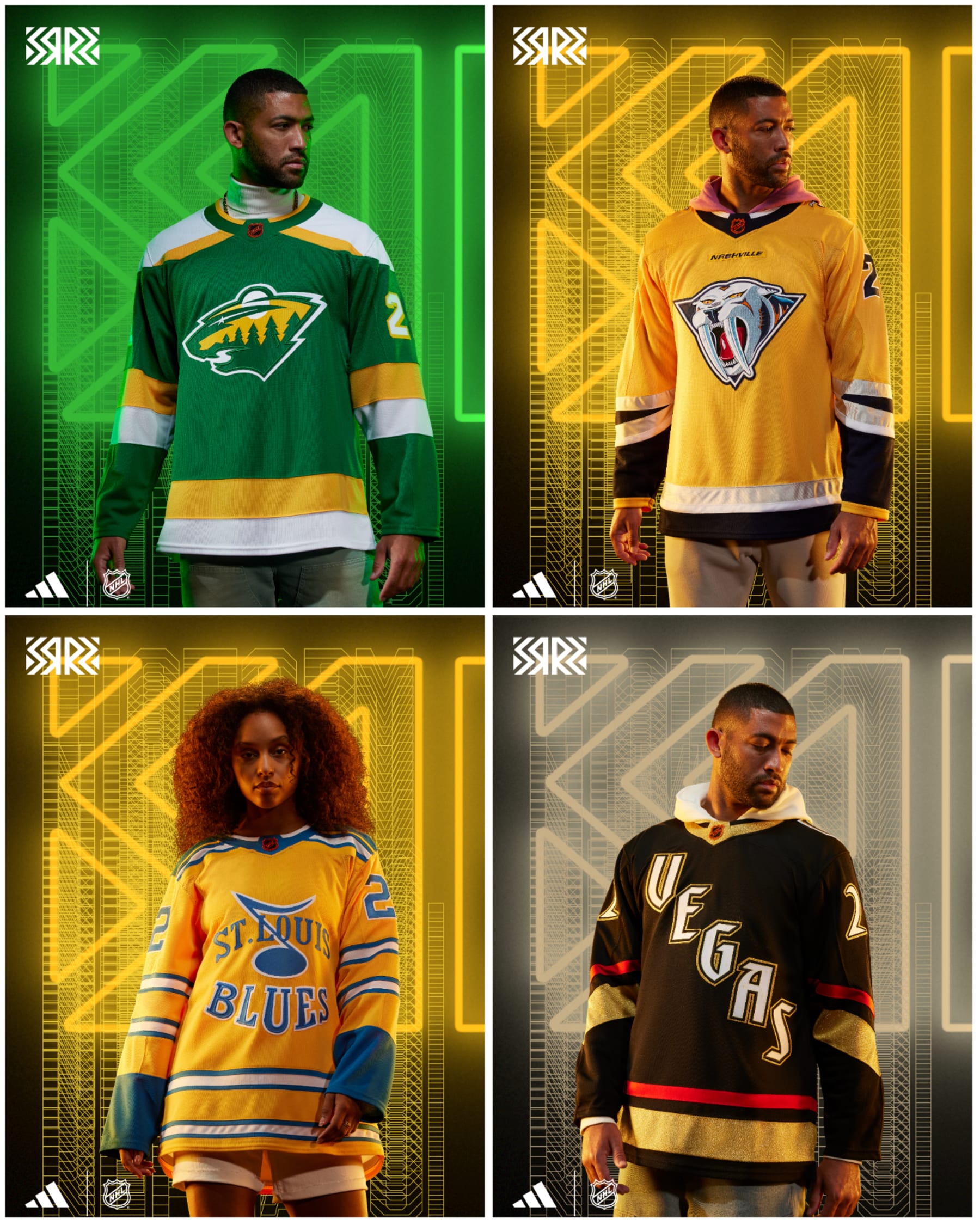
Minnesota Wild: Polaris
In 2021's Reverse Retro campaign, the Wild were able to create a white Wild jersey with all the accouterments of the North Stars. The colors and jersey design were all from back in the day when they skated in Bloomington at the Met Center. It was a huge hit, and Wild fans could not get enough. Why mess with a good thing?
This time around it's a green jersey done in the style of the North Stars jerseys from 1978-88. It's gorgeous, it's wonderful, and it once again makes me wish the Wild were named the North Stars because what's better than our own nostalgia?
Nashville Predators: Condiment
The Predators' "Grey Poupon" third jersey from 2001-07 with the cartoonish saber-tooth tiger was routinely panned for mostly the color but also how the color with the logo just didn't really connect. Thankfully, the Preds decided to ask the question: What if we just took that jersey and changed the shade of yellow?
And the answer to that is: Yes, please do that. And they have. Nashville embracing the bright yellow has been a wonderful development over the past few years and taking this infamous third jersey and making it brighter is perfect. Their 2021 Reverse Retro jersey is nearly impossible to beat, but this is close to perfect as well.
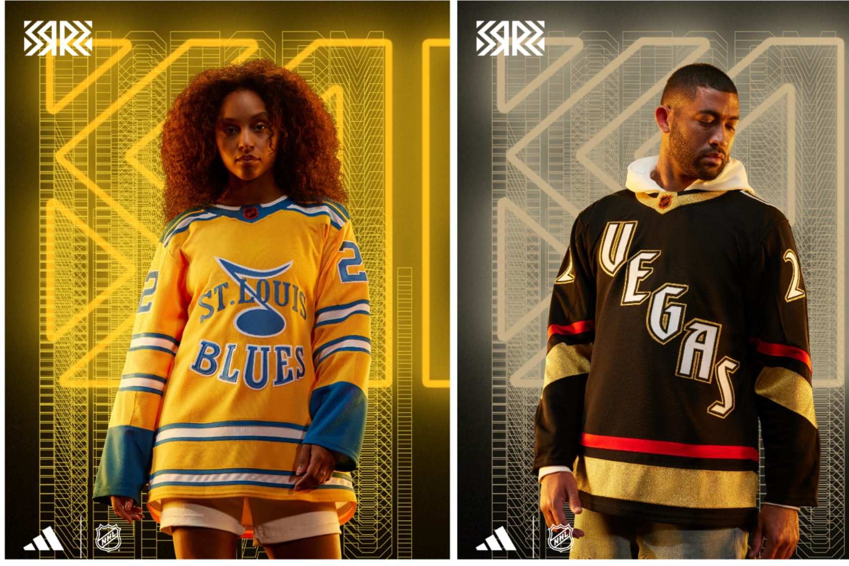
St. Louis Blues: Shiny
Speaking of teams embracing yellow, hello St. Louis! This throwback-esque jersey looks like it lifted a long-ago style with the striping everywhere and the blue note logo and the word marks leave no secret as to which team this belongs to. The logo was the Blues' prototype when the team was founded but was changed when they officially started play in 1967.
Throwing that on a bright yellow jersey makes it pop loudly, and the stripes make it seem like something older than the late '60s. It might not resonate a ton outside of St. Louis, but it looks good and has a historical background.
Vegas Golden Knights: Stardust
The Golden Knights have shown they don't fear doing things differently. Gold jerseys with shiny gold helmets aside, coming up with a Reverse Retro for a team that's been around six years is mostly an excuse to get really creative.
The diagonal wordmark along with the number font immediately made me think of classic Las Vegas casinos and for good reason. The "Vegas" font on the front is that of the Excalibur Hotel and the numbers are from the Stardust. Finding a way to bring the bright, brash signs that would lure you in to blow your cash when cruising the Strip to a jersey is fantastic. Would it be more fun if it wasn't a black jersey? Maybe, but then the glow-in-the-dark letters and numbers on the Reverse Retro might not have the same effect. Touché, Adidas.
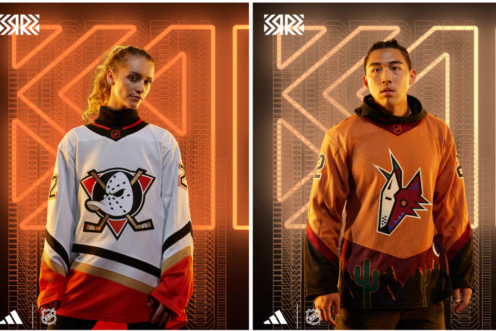
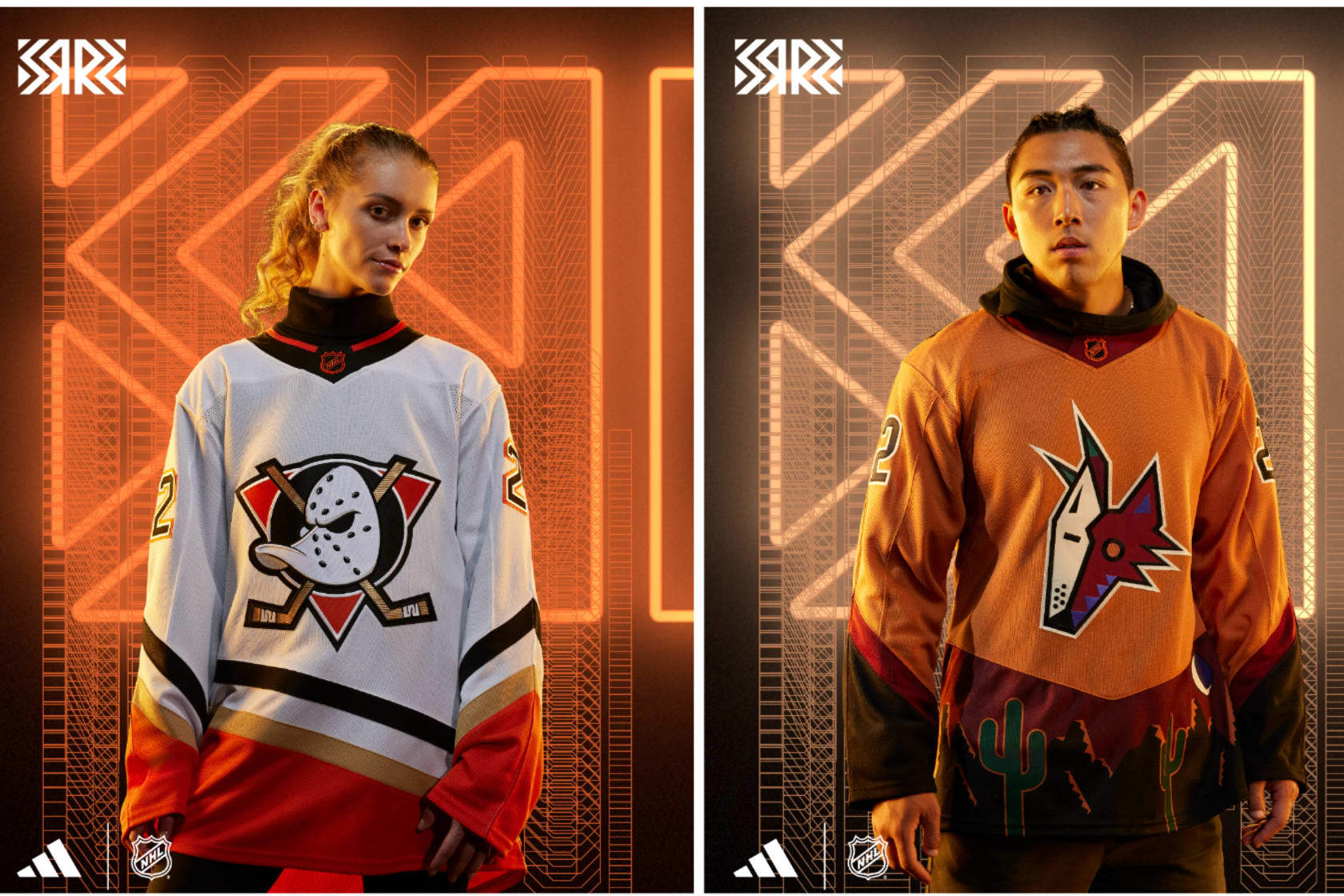
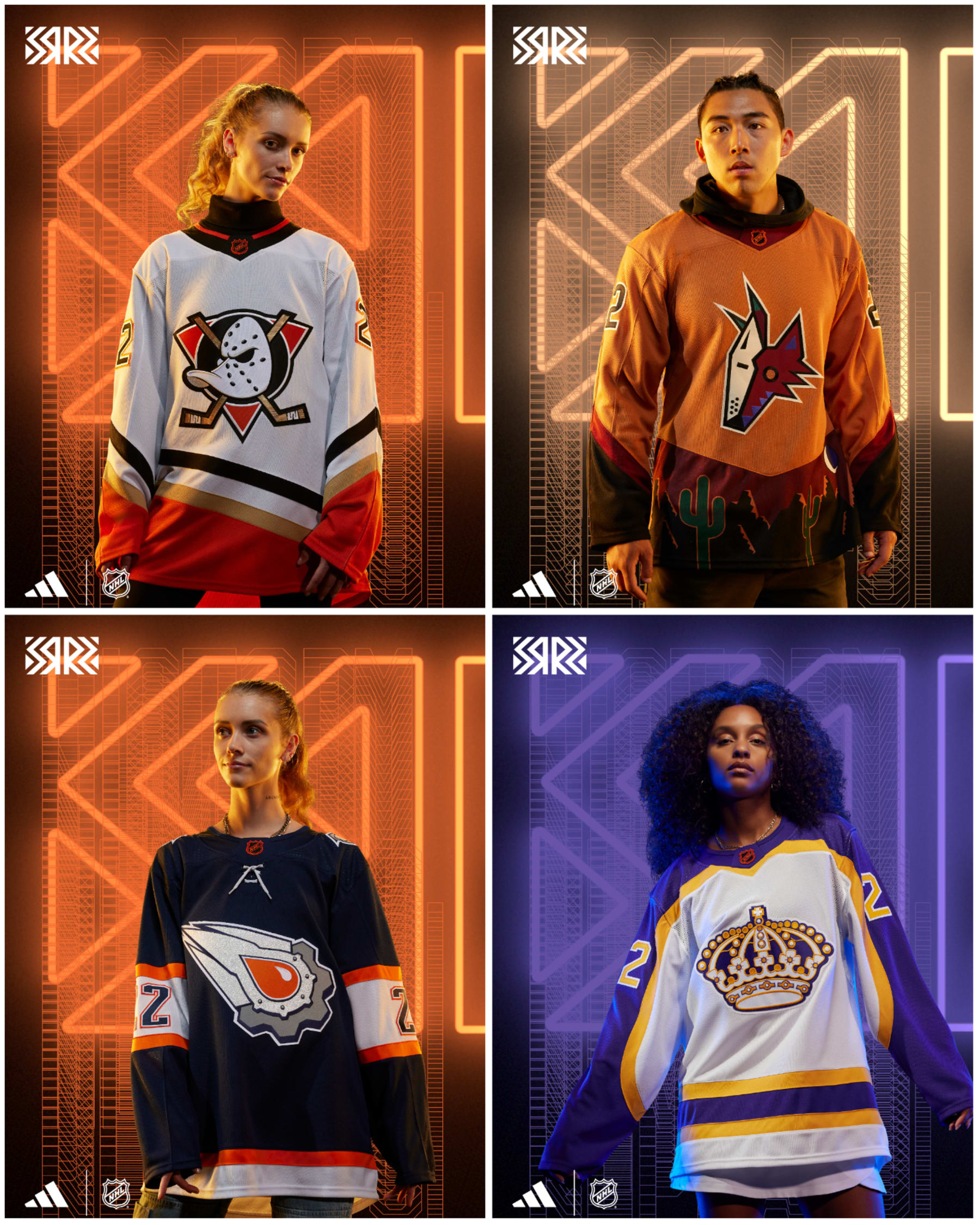
Anaheim Ducks: Classic
The original Mighty Ducks of Anaheim jerseys were perfect. The teal, plum and white colors popped, and oh yeah, there were the Disney movies. The goalie duck mask with crisscrossed sticks logo is as good as it gets, and bringing that back as much as humanly possible is the 100 percent correct move.
They've done it with their third jerseys, and now they're bringing it back for Reverse Retro, only with the current orange, black and copper colors. My suggestion: Go back to this style immediately and never look back.
Arizona Coyotes: Dusty
When the Coyotes broke out the "Peyote" coyote third jersey from 1998-2003, the main question people had was: What...is even happening? Fair question, but taking inspiration from their Kachina logo and turning it into a panorama for a jersey was inspired. The 2021 Reverse Retros in purple were fantastic.
Going back to the well is usually a reason to be critical—but not with this design. The sunset orange with red and brown makes for a super change from the original purple from 2021. This actually looks like the desert, which makes it an instant upgrade. A perfect 10.
Edmonton Oilers: Respawn
The Oilers are guilty of messing with a good thing far too often when it comes to their jerseys. Their 1980s white-and-blue jerseys are perfect, but I get it—sometimes teams need to do something different to make money.
When they had Todd McFarlane—huge Oilers fan, comic book artist and creator of "Spawn," design a third jersey to take them into the new millennium, what he concocted was so different than anything they had before. It also seemed like something from 100 years in the future.
Taking that exact look and adding a color other than dark blue or gray to highlight the oil drop and on the stripes makes this a huge upgrade on a unique original.
Los Angeles Kings: Regality
How is it that every time the Kings break out something from the past, it's almost always perfect.
Kings jerseys from 1980-88 were Forum Blue and gold like the Lakers, but they never were in white. The Lakers fixed that for themselves years ago, and now the Kings have their own version of it, and my goodness, it's glorious.
The crown is opulent, the Forum Blue sleeves against the white jersey just pop. Every time we see the crowns come out, it makes us wonder why they ever changed, and this makes that pang even stronger.
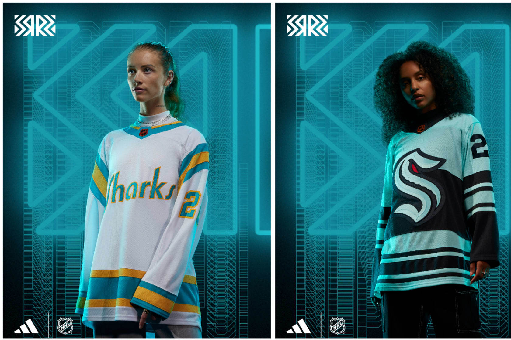
San Jose Sharks: Homage
The Sharks weren't the Bay Area's first NHL team; that honor belongs to the California Seals and that's who the Sharks are paying tribute to with these style-perfect throwbacks. This jersey is made up just like their home sweaters in the team's final years in Oakland just with "Sharks" across the front as opposed to "Seals."
Better to be the hunter than the hunted, right? The Sharks might not be playing well on the ice, but they're going to look really good with their new home and away uniforms and now this throwback beauty.
Seattle Kraken: Newfangled
It's the Kraken's first go-round in the Reverse Retro game, and well, listen, it's OK. There's a lot more sea green with this setup and a lot of stripes to make it feel old-timey.
Somehow the Kraken logo appears to have gotten even bigger on the front of this jersey, which in itself is an impressive feat of stitching technology. Going straight to a full-blown recreation of the Seattle Metropolitans (Seattle's original NHL team from 1915-24 and Stanley Cup winners in 1917) sweaters but with Kraken branding feels like something that's going to be done at some point, and I cannot wait for that.
Vancouver Canucks: Hipster
The Johnny Canuck logo is an all-time fun emblem. He's got a flannel shirt on with a toque, and he's got a sick beard. He'll help cut down trees and recommend you a great beer all at the same time. The original blue, white and green colors are great, although I thought we were done with putting numbers on the front of the jersey.
Regardless, it's got a historical throwback feel to it with the number font and just a good look. Is it awkward that the Canucks' AHL team in Abbotsford, British Columbia, uses Johnny Canuck as their full-time logo and jersey crest? Does it matter when it looks cool?
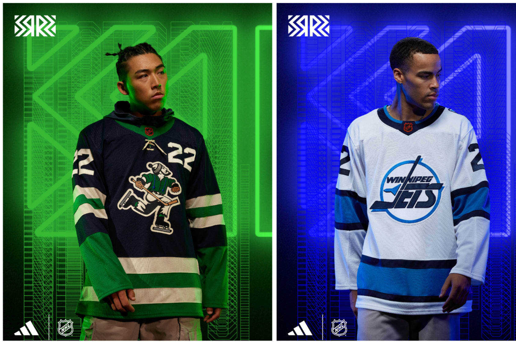
Winnipeg Jets: Frostbite
The original Jets jerseys from 1990 until they moved to Phoenix in 1996 were some of the cleanest, best-looking sweaters of all time. The stripes were simple, and the white, blue and red colors all popped on either the home white or road blue jerseys. The logo is sublime.
This version for the modern Jets is a good representation of the deep freeze the jersey has been in since the mid-'90s. Taking that original perfect jersey and giving it the current Jets colors shows one thing: That little splash of red on the original means everything to making it look beautiful. Does the new one still look great? Of course it does—it's just a bit icier than you'd want. Next up: A Thrashers throwback. Don't deny your history!
NHL to Change Jersey Supplier When Adidas Contract Ends After 2023-24 Season
Jul 28, 2022
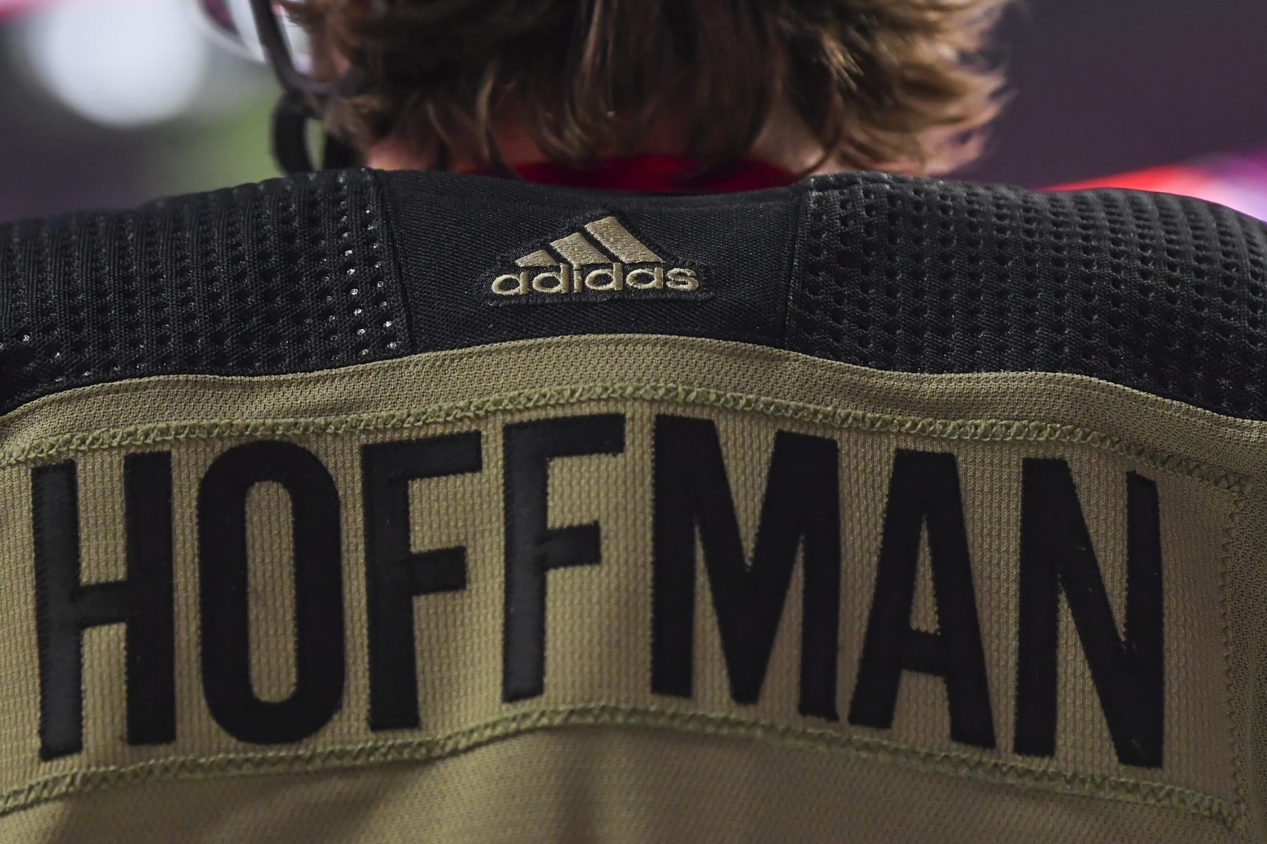
MONTREAL, QC - NOVEMBER 11: The Adidas logo is seen on Mike Hoffman"u2019s #68 camouflage Montreal Canadiens jersey benefiting the Support Our Troops organization on Remembrance Day during warmups against the Calgary Flames at Centre Bell on November 11, 2021 in Montreal, Canada. The Montreal Canadiens defeated the Calgary Flames 4-2. (Photo by Minas Panagiotakis/Getty Images)
The NHL announced Thursday that it will not be continuing its jersey deal with Adidas after their contract expires following the 2023-24 season.
"The NHL and Adidas look forward to continuing to work closely together over the next two years and to a smooth transition to the new authentic NHL uniform supplier, which will be announced by the NHL at the appropriate time," the league said in a statement.
Per ESPN's Greg Wyshynski, it was Adidas that served as "the catalyst in not seeking to renew with the NHL."
The deal between the NHL and Adidas was for seven years, when the apparel company replaced Reebok starting in the 2017-18 campaign. Reebok had held the jersey rights starting with the 2005-06 season.
Reebok was paying the NHL $35 million per year for those rights. Per Wyshynski, Adidas reportedly doubled that payout.
Adidas also signed star players like Edmonton Oilers forward Connor McDavid to promote the apparel company, though according to that report, "sources told ESPN that players with expiring endorsement deals have been told by Adidas that those deals would not be renewed, which was a harbinger that the company was heading for a split with the NHL."
Adidas has a large footprint in the soccer world, with kit deals with clubs like Real Madrid, Arsenal, Manchester United, Juventus and LAFC, along with several national teams.
In the United States, Nike has a stronghold on the jersey game, with deals in place with the NFL, NBA and MLB. Nike also has a number of deals with college programs.
Now, the door will be open for apparel companies to work with the NHL.
Kobe Bryant's Rookie Lakers Jersey Could Sell for $3-5M at Auction; May Set Record
May 1, 2022
1996: Rookie Kobe Bryant of the Los Angeles Lakers dribbles during a game at the Great Western Forum in Inglewood, CA. (Photo by Icon Sportswire)
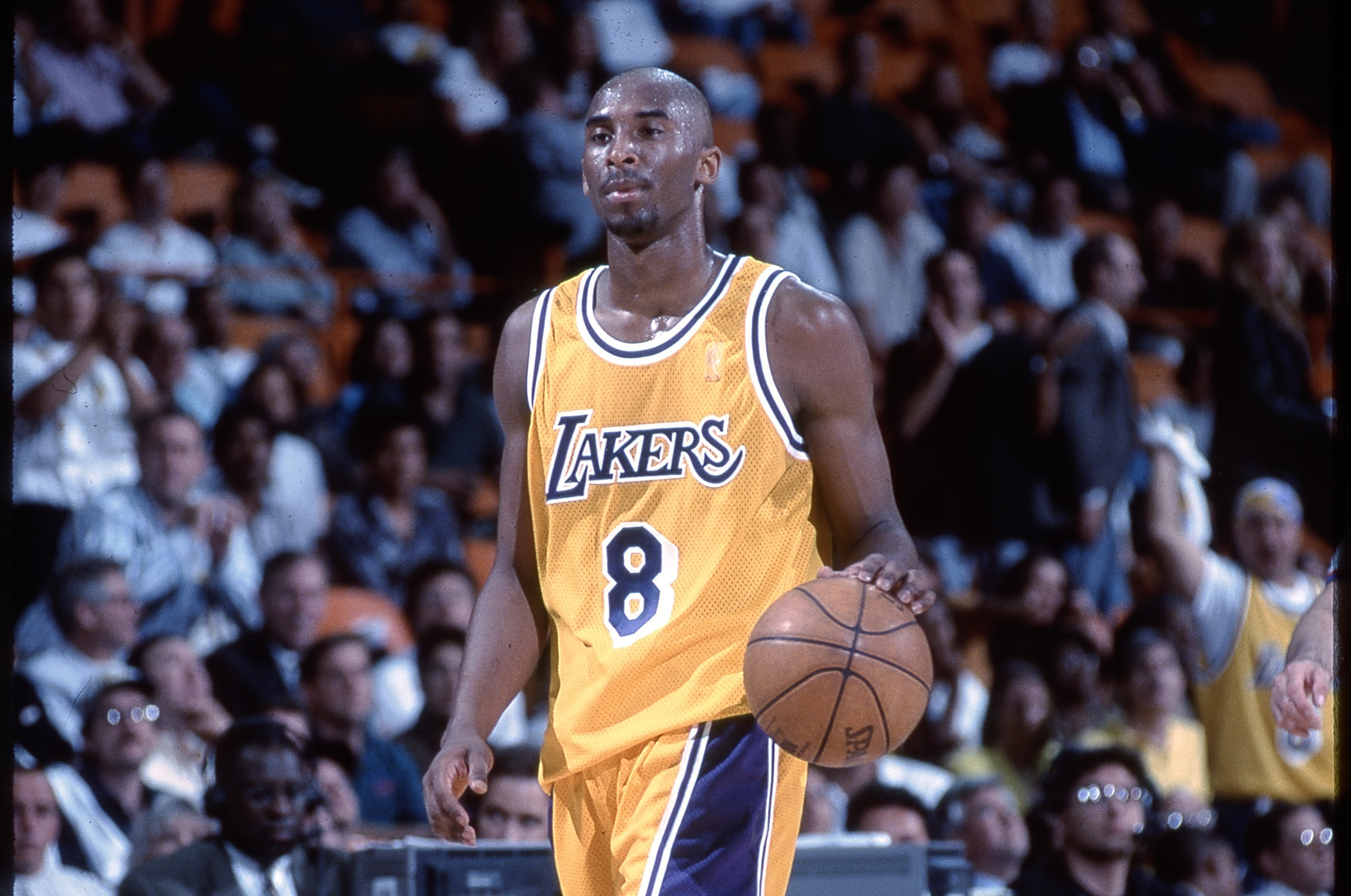
A Los Angeles Lakers jersey worn by Kobe Bryant during his rookie season could set a record at auction this month.
The auction will begin May 18 and is expected to fetch between $3 and $5 million, David Kohler of SCP Auctions predicted, per Associated Press (via WNYT).
"We feel this could bring a record for any basketball jersey," Kohler said.
The current record is also held by a Bryant rookie jersey, which sold for $3.69 million last May. Although that one was autographed by the Hall of Famer, the latest auction features a jersey that was worn in at least two playoff games during the 1996-97 season.
The seller reportedly held the jersey for 25 years but is now ready to part with the piece of memorabilia after seeing the soaring prices for Black Mamba collectables. A Bryant trading card also sold for $1.8 million last year.
It means Kobe fans will have to pay up for authentic merchandise of the superstar.
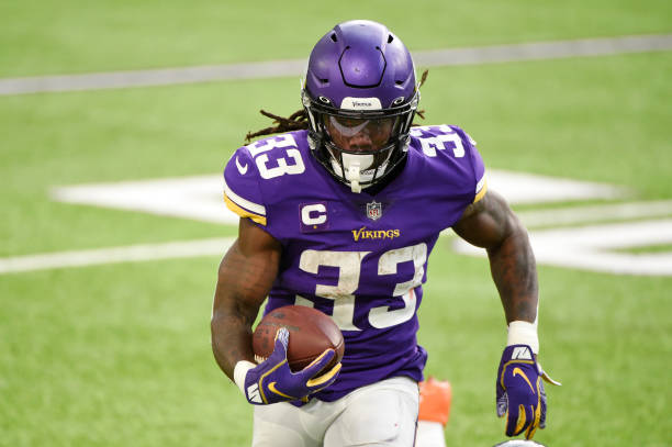
Vikings' Dalvin Cook Denied Request to Wear No. 4 Jersey in 2022 NFL Pro Bowl
Jan 30, 2022
MINNEAPOLIS, MINNESOTA - JANUARY 09: Dalvin Cook #33 of the Minnesota Vikings takes the field during introductions prior to the game against the Chicago Bears the at U.S. Bank Stadium on January 09, 2022 in Minneapolis, Minnesota. (Photo by Stephen Maturen/Getty Images)
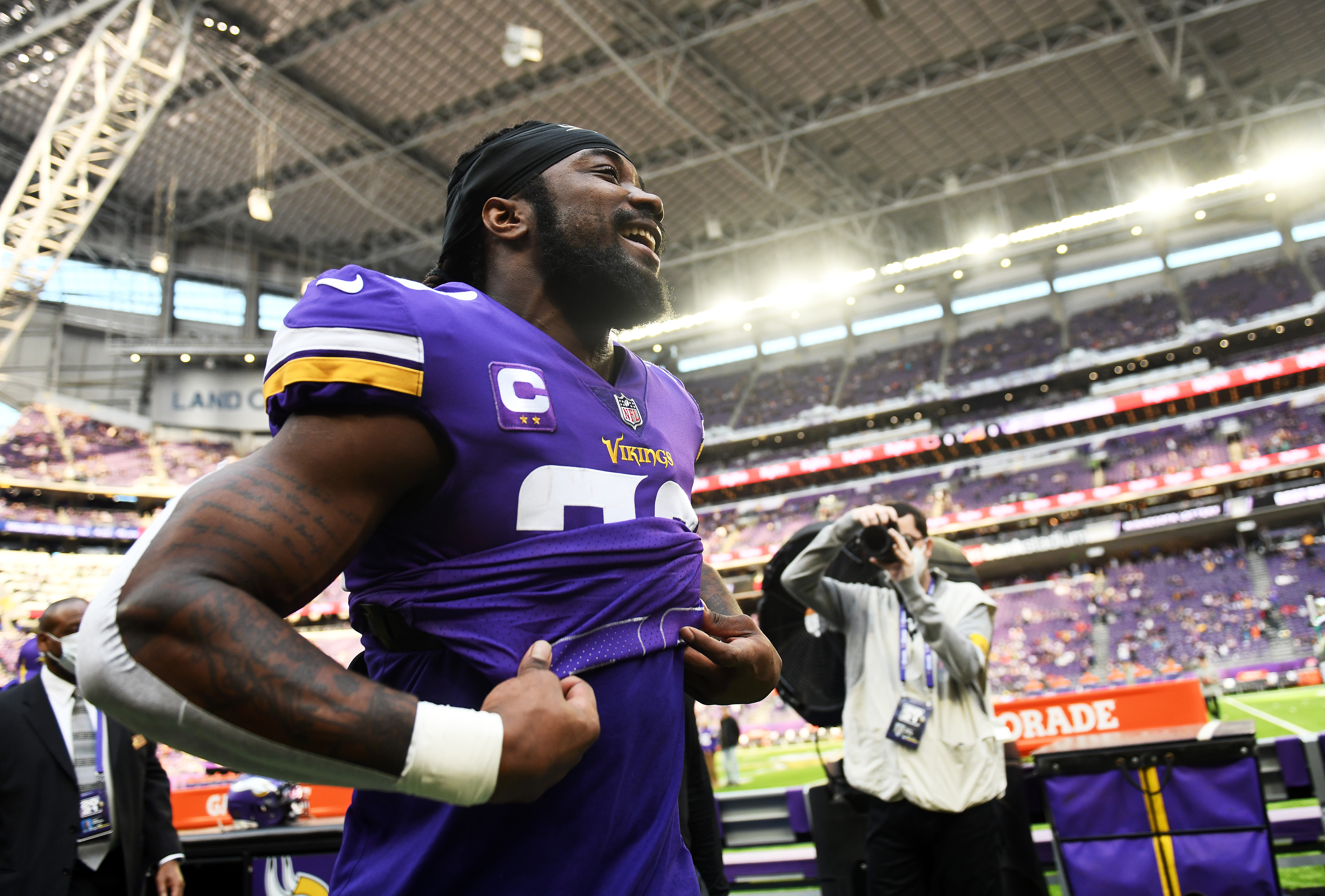
Minnesota Vikings star running back Dalvin Cook plans to switch from No. 33 to No. 4 next season, but the NFL won't allow him to make the change for this year's Pro Bowl, according to Chris Tomasson of the St. Paul Pioneer Press.
#Vikings RB Dalvin Cook, who broke the news on Patrick Peterson's podcast last October that he'll change from uniform No. 33 to 4 next season, had asked to wear No. 4 in next Sunday's Pro Bowl. But request was denied because players have to wear the number they wore during season
In October, Cook said on Patrick Peterson's All Things Covered podcast that he was making the switch.
"Breaking news. ... I'm putting on [No.] 4, I'm telling y'all I’m putting on 4," he said.
Cook has also posted two separate pictures of himself wearing a No. 4 Vikings jersey in the past two weeks on Instagram.
So a change is coming. Just not until the 2022 season.
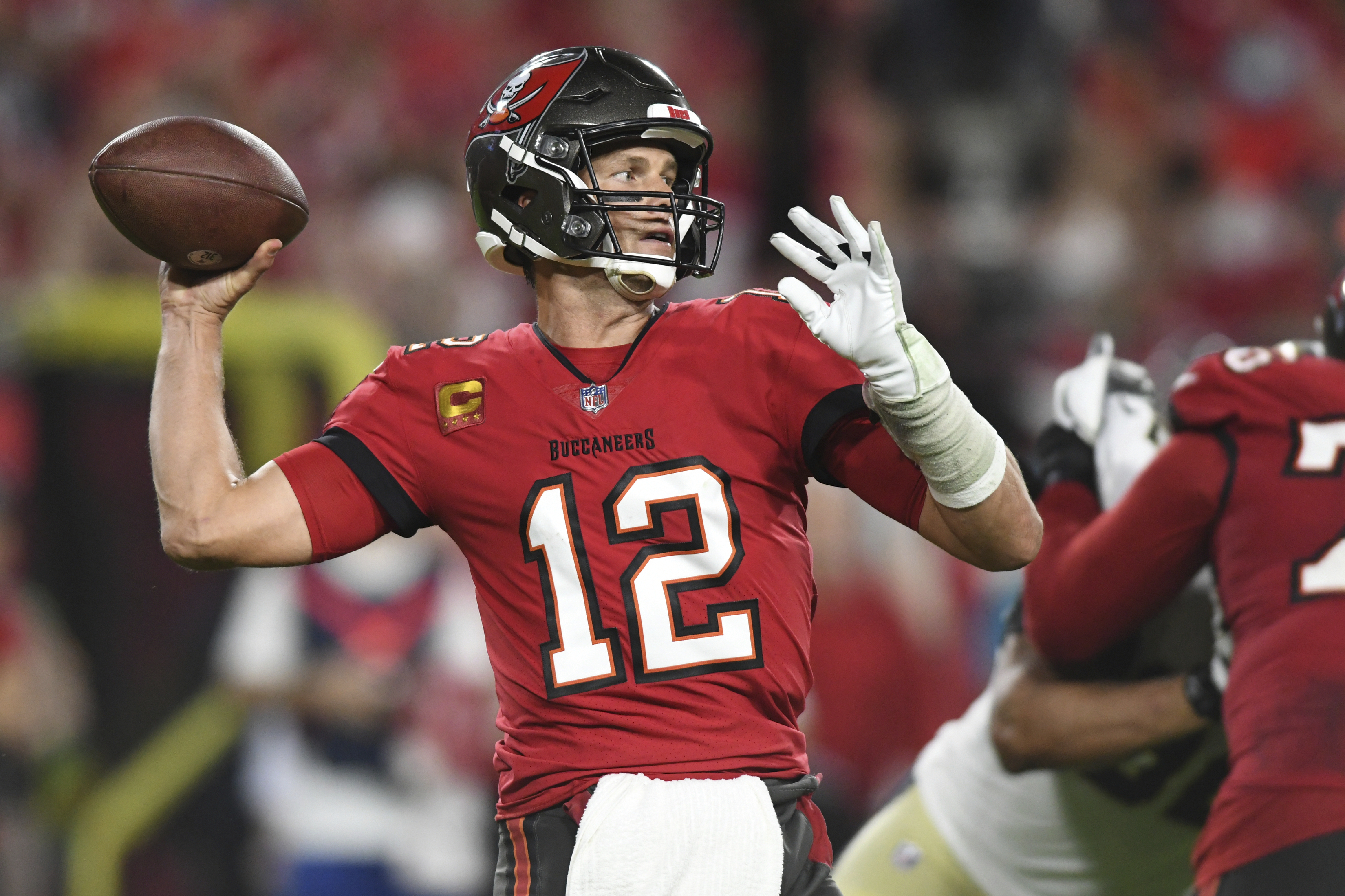
Tom Brady Historic Signed, Game-Worn 'G.O.A.T' Bucs Jersey Could Sell for over $600K
Dec 26, 2021
Tampa Bay Buccaneers quarterback Tom Brady (12) throws a pass against the New Orleans Saints during the first half of an NFL football game Sunday, Dec. 19, 2021, in Tampa, Fla. (AP Photo/Jason Behnken)
A game-worn, autographed Tom Brady jersey could sell for over $600,000 at auction, per TMZ Sports.
Not only did the Tampa Bay Buccaneers star sign his name and write his game stats on his No. 12 digits, but he also added a "G.O.A.T" inscription as the Greatest of All Time.
Ultra-Rare Tom Brady 'G.O.A.T' Bucs Jersey Could Fetch Over $600k At Auction https://t.co/ZEgwC4odBu
Goldin Auctions put the jersey up for bidding, saying it is "believed to be the only time he has ever inscribed this on a game used jersey."
Brady also wrote "Super Bowl LV MVP" on the jersey.
The quarterback was named Super Bowl 55 MVP after leading the Buccaneers to a 31-9 win over the Kansas City Chiefs. It was Brady's seventh Super Bowl victory and fifth Super Bowl MVP award.
The jersey itself was worn in Week 17 of the 2020 regular season, about a month before they won the title. Brady totaled 399 passing yards and four touchdowns in the 44-27 win over the Atlanta Falcons.
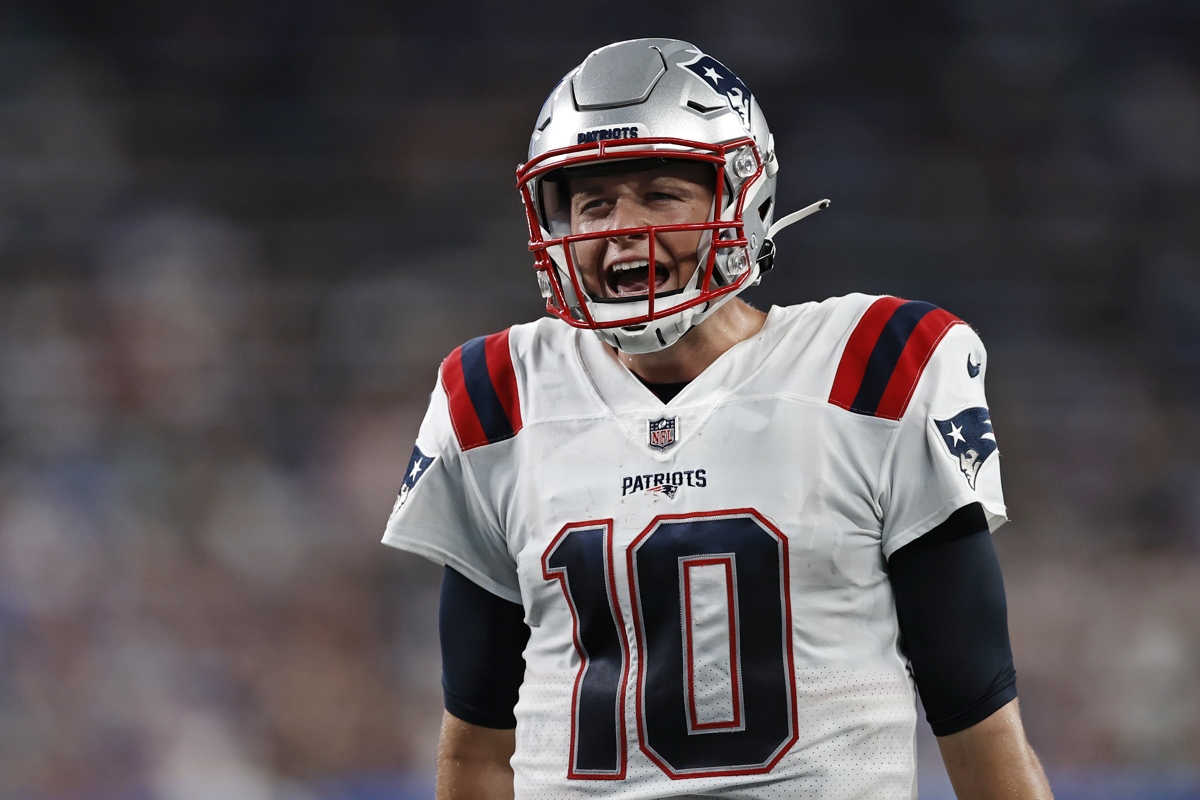
Patriots' Mac Jones, Bears' Justin Fields Among Top-Selling NFL Jerseys Before Week 1
Sep 9, 2021
New England Patriots quarterback Mac Jones (10) reacts against the New York Giants during an NFL preseason football game, Sunday, Aug. 29, 2021, in East Rutherford, N.J. (AP Photo/Adam Hunger)
Buffalo Bills star Josh Allen currently has the best-selling jersey in the NFL, while two rookie quarterbacks rank among the top five heading into Week 1 of the 2021 regular season.
Mac Jones of the New England Patriots and Justin Fields of the Chicago Bears rank second and fourth in NFL jersey sales since Aug. 1, respectively, according to Fanatics:
Jones and Fields making it into the top five against such established players speaks volumes about how high the expectations are for both rookies.
Tom Brady (No. 3) and Patrick Mahomes (No. 5) are superstars in the NFL, so it's hardly a surprise to see them high on this list.
Allen has only played at an elite level once in his three seasons, but his historic leap in 2020 catapulted the Bills back to prominence in the AFC. Anyone who has followed the Bills Mafia on social media knows how passionate the fanbase is about supporting their team.
Jones is one of three rookie quarterbacks expected to make their first career start in Week 1. Trevor Lawrence of the Jacksonville Jaguars and Zach Wilson of the New York Jets should also line up under center.
The Patriots made Jones their starter on Aug. 31 when Cam Newton was released. The 23-year-old had a fantastic preseason, completing 36 of 52 passes for 389 yards and one touchdown in three games.
How did Mac Jones perform in the preseason by advanced passing metrics relative to the other ten drafted quarterbacks from the 2021 class?
The Bears have opted to go with Andy Dalton as their No. 1 quarterback to start the regular season. Fields should eventually take over the offense after the team traded up nine spots to select him with the 11th overall pick in the 2021 draft.
Fields, like Jones, also looked good during the preseason. The Ohio State alum went 30-of-49 with 276 passing yards, two touchdowns, no interceptions through the air. He also had 11 carries, 92 yards, one rushing touchdown in three games.
Chicago fans are understandably excited to have a young quarterback with Fields' potential. Even though the wait for him to see the field will be a little longer than they would like, it's clear by sales of his jersey that they will be ready to greet him with open arms whenever head coach Matt Nagy makes the switch.
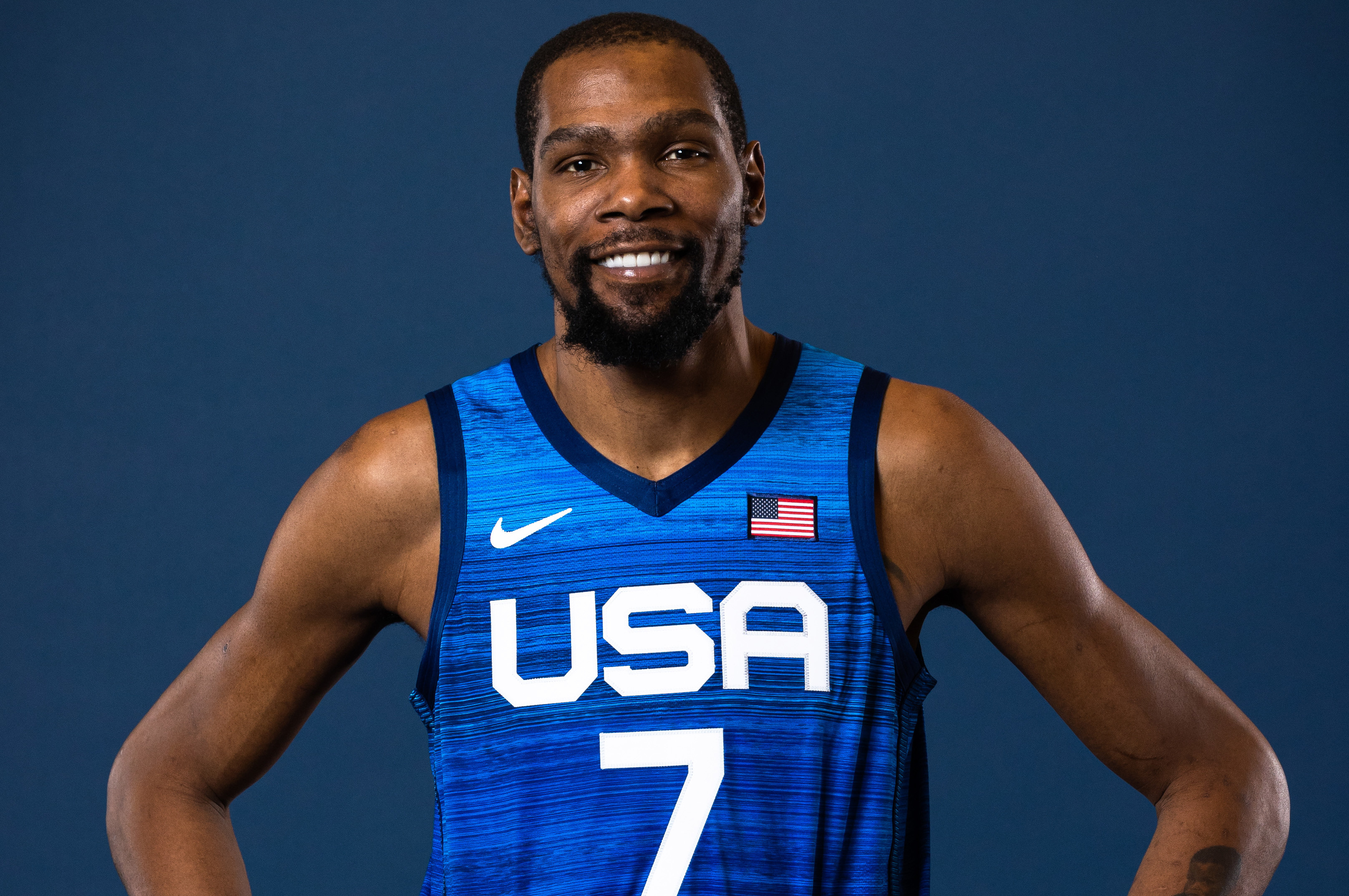
Kevin Durant, Damian Lillard, Team USA Show Off New Uniforms Before Tokyo Olympics
Jul 8, 2021
LAS VEGAS, NV - JULY 7: Kevin Durant #7 of Team USA poses for a portrait at the ARIA Resort & Casino on July 7, 2021 in Las Vegas, Nevada. NOTE TO USER: User expressly acknowledges and agrees that, by downloading and or using this Photograph, user is consenting to the terms and conditions of the Getty Images License Agreement. Mandatory Copyright Notice: Copyright 2020 NBAE (Photo by Stephen Gosling/NBAE via Getty Images)
Several members of the United States men's national basketball team modeled their new uniforms Thursday ahead of the upcoming 2021 Summer Olympics in Tokyo.
As seen in the following video posted on the NBA's official Twitter account, most of Team USA took part in a pre-Olympics photo shoot:
Among the biggest stars to show off the blue unis with white lettering and red trim were Kevin Durant of the Brooklyn Nets, Damian Lillard of the Portland Trail Blazers, Bradley Beal of the Washington Wizards, Draymond Green of the Golden State Warriors and Jayson Tatum of the Boston Celtics.
Only three of the 12 members of Team USA were not present for the photoshoot, but they had a good reason.
Phoenix Suns guard Devin Booker and Milwaukee Bucks teammates Jrue Holiday and Khris Middleton are all playing in the 2021 NBA Finals.
Other players featured in the video include Miami Heat center Bam Adebayo, Detroit Pistons forward Jerami Grant, Chicago Bulls guard Zach LaVine and Cleveland Cavaliers forward Kevin Love.
With several top players such as LeBron James and Anthony Davis of the Los Angeles Lakers, Chris Paul of the Suns, Stephen Curry of the Warriors and James Harden of the Nets removing themselves from Team USA consideration, many members of the squad will be Olympic debutants in Tokyo.
Durant, Green and Love are the only members of head coach Gregg Popovich's team with Olympic experience under their belts.
Even so, the Americans will be heavily favored to win gold for a fourth consecutive Olympic Games when the 2021 Tokyo Olympics begin July 23.
Report: Vikings' Dalvin Cook Won't Switch to No. 4 Because of Cost of Unsold Jerseys
Apr 23, 2021
MINNEAPOLIS, MINNESOTA - DECEMBER 20: Dalvin Cook #33 of the Minnesota Vikings runs with the ball as Eddie Jackson #39 of the Chicago Bears attempts to tackle him during the first half at U.S. Bank Stadium on December 20, 2020 in Minneapolis, Minnesota. (Photo by Stephen Maturen/Getty Images)
Minnesota Vikings running back Dalvin Cook has reportedly decided not to switch to No. 4 because of the cost of buying up the remaining stock of his current No. 33 jerseys.
According to ProFootballTalk's Mike Florio, Cook or any other player who wants to switch numbers must buy all remaining inventory of jerseys with their previous number. They reportedly must purchase the remaining supply from Fanatics at retail price.
Cook, who wore No. 4 during his playing days at Florida State, was reportedly considering a switch and "looking at the inventory costs" this week, per Chris Tomasson of the Pioneer Press.
The switch became a possibility after the NFL passed a new jersey number rule this week that will relax some of the previous restrictions.
Now, running backs, wide receivers, tight ends, linebackers and defensive backs are allowed to wear single-digit numbers, which is something that is commonplace in high school and college football.
The No. 4 jersey treated Cook well in college, as he registered three 1,000-yard rushing seasons with the Seminoles, including a junior campaign in which he rushed for 1,765 yards and 19 touchdowns.
Cook has thrived with the No. 33 on his back in the NFL, however, earning Pro Bowl nods in each of the past two seasons.
The 2017 second-round pick is coming off his best NFL season to date, rushing for 1,557 yards and 16 touchdowns while also catching 44 passes for 361 yards and one score in 2020.
That production helped Cook land a five-year, $63 million extension with the Vikings in September.
Despite that contract, Cook thought better of investing heavily in a mountain of his own jerseys.
Some of the most exciting moments in the buildup to a soccer season are the new kit reveals. In Major League Soccer, clubs alternate between releasing primary and secondary kits every year...